This is scanned artwork with the contrast exaggerated to make it easier to see the problem of stray pixels caused by paper texture, dust, etc.  How do you deal with this problem, especially when it’s hard to see where the pesky little unwanted pixels are? Usually when I'm working on an image in Photoshop, the stray pixels are less obvious, more like the image below:
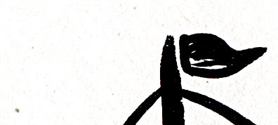 What’s the big deal, anyway... who cares about a few stray pixels? In some cases they won’t matter, but when your image will be used as an illustration it’s amazing how often they turn into glaring blotches in the printed piece that really are bothersome. To find and eliminate them, read on.
 This is line work that has been scanned in and lifted off the background white paper. This post explains how to do that.
I zoomed in to erase any visible pixels. But are there more lurking? To find out, add the Stroke Layer style to the lines layer. In the top menu bar, choose Layer>LayerStyle>Stroke. When the dialog box opens, use these settings (most are default):
Size- 3 to 5 pixels
Position- Outside
Blend Mode- Normal
Opacity- 100%
Fill type- Color (pick a bright contrasting color such as red)
 Either the drawing suddenly contracted chicken pox, or the red stroke around every pixel shows that there are indeed many stray pixels. Select them with the Lasso tool and delete or use the Eraser tool to remove them.
These car images can be enlarged by clicking on them, by the way.
 I don’t worry too much about a few blips near the line work, since they will blend in. It’s the glitches floating inches away that seem to show up most annoyingly in the printed book. Now that the art is cleaned up, time to finish coloring it in. Don’t forget to get rid of the Strokes Layer style. The easiest way is in the Layers palette, drag the Effects to the trash, the small icon on the lower right.
 Here’s our little car, ready for his close-up. Wonder why he’s got a sail on top?

Being a mere human being can be difficult at times... in order to change my web host, I had to wait on hold at least 1/2 an hour several times, call three different companies who referred me to each other, and discover the-previously-unknown-to-me Company X (who supposedly was “the only one” who could unlock my domain name) was a sister company to the web hosting company I was trying to fire.
Solution: call the Domain Registering Company yet again, choose the option “seeking to switch domain TO” said company, because then they answer the phone. The conversation went thusly:
Roboguy: You have to call Company X, because only they can unlock your domain.
Me: No, I don’t have to call X because I am the administrator, I own this domain, and I pay for it.
Repeat four times, at ever increasing volume on my part. Mention this is America and it’s a free country, etc.
Roboguy: You could do an inhouse transfer from a wholesale to a retail account.
Me: (?) Will that allow me to unlock this domain?
R: Yes.
Me: Okay.
Five days later, I rid myself of two odious, overcharging corporate entities for good. Yippee! Then to top it off, I did in fact split an atom:
 It really wasn’t that hard!

As mentioned in this previous post, I’m attempting to come up with a logo and/or banner for I.N.K., a group blog written by nonfiction children’s book authors. The previous ideas posted on I.N.K. are here.It turned out to be a big learning experience, the main lesson being “simplify!” I kept wanting to imply a sequence of events and/or add too much information. Also, in looking at a lot of author and book-related logos, the pen/ink bottle imagery is quite the cliché and pretty old-fashioned. In this day and age of word-processing and PDFs, maybe some other metaphor would be better.
The other surprising-to-me bit of information is that some of the bloggers didn’t want the logo to be “kid-like.” Not too babyish I get, but not kid-like? Maybe those terms mean the same thing in some people’s minds... whatever! It demonstrates not only the difficulty of working with a group on a project like this, but also the limitations of doing things by email.
Anyway, I’d prefer the logo to be kid-like, definitely, but not over the top with cutesyness. I went with “printed pages” as the concept, with differing fonts to represent the diversity of bloggers. The bright colors invoke youthful vitality and will show up well even at a small “button” size on a web page.
 I’ve already received some comments that it’s not anything like the previously posted ideas, and some people liked one or the other of those. Hey, they were too elaborate and I like this one! The multi-colored one, that is. I did this version below for the more visually conservative. But I hope nobody votes for it, secretly. (Guess it’s not a secret now!)
 However, there are other contending ideas from another talented artist. So, who knows what the logo will be in the end? The I.N.K. bloggers are voting in the next day or two, so we’ll see what happens.
If you read many blogs, you’ve already seen plenty of photos of cats, dogs, birds, and other beloved pets. But I have a good excuse since my cat Knickers modeled for one of my art quilts. The idea was to show her gazing out my studio window. It was easy enough to take a photo and work up a sketch in Photoshop. I made several attempts to render her in fabric, first with paint. Below left is acrylic paint on a dotted brown fabric, in the center is fabric paint on a mottled brown fabric. Both looked murky and old-fashioned, like an old engraving. The cat head would be placed on top of an orange fabric that was intended to represent pine needles. It seemed to me that the real problem was at this angle, Knicker’s white nose looked disconnected from the rest of her brown fur. The value contrast broke up the shape of her head too much and it just looked weird. Below right is a more abstract cat made from marbled fabric with painted eyes and ears. It looked even more visually scrambled, but I liked how the marbled shapes could represent fur without being too literal.
 So, I used a much lighter marbled fabric and made the cat head one unified, lighter color with metallic acrylic lines. It showed up well against the pine needle fabric, which was the point after all. And yes, those are real whiskers, shed naturally by Knickers. They were very tricky to sew on because they kept springing out of the monofilament stitches.
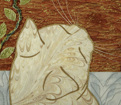
 So here she is... she could care less whether her fabric self got a bleach job. When she was at the vet the other day for her annual check up, the technician was exclaiming over her "eye makeup" and extra soft, rabbit-like fur. She definitely is a beauty, so one of these days I’ll just have to do a real portrait, full face this time.

Geraniums are a favorite flower of mine. I have a couple of quilting projects in progress (or more accurately languishing... just like the garden, coincidentally.) Below is one of many photos I’ve taken in Winter Park, Florida, where the flowering containers along the city streets rival those found in England and other countries.
 Below is a close up detail of a much larger WIP. The plum color is the base fabric, while the painted part is done with acrylics (Golden liquid matte) directly on it. On the left are ivy leaves pinned in place, awaiting glue-basting or possibly rearrangement. The whole large work (around 40" X 60") is temporarily attached to 1/2" foam core. The idea is to add more pieces of fabric, then stitching. I’m not sure whether any fabric needs to be added to the geraniums because they look pretty good as is. But that’s one nice aspect of fabric collage; you can put pieces on, move them around, try something else, until it looks the way you want it to.
 A tight close-up of the painting. I was trying to keep it loose. How the stitching will go is a bit of a question mark at the moment. Follow the brush strokes? Zig-zag around? Ovals? Curvy-swervies? Lots of possibilities. One thing about stitching through relatively thick acrylic... the needle leaves holes, so you have to be happy with the first attempt or be able to fashion some kind of cover up with added fabric perhaps. You could use paint as spackle over the needle holes, probably. Then there are always beads(!)
  I do have this more finished piece to refer to, also featuring geraniums, but with no painting. This one is stitched with a variegated thread in flowery shapes.
 So, we’ll see what happens after my current deadlines are over. Do you feel like making flowers in spring?
 This hand-painted little sun doesn’t look very promising yet, but let’s see what can be done to jazz it up in Photoshop. It was painted on plain Strathmore drawing paper with black watercolor in a drybrush fashion. I used a lightbox so no pencil lines had to be erased, then it was scanned in. The process of getting rid of the white background is detailed in this previous post.
The first thing to do was even it out a little because it was too heavy on the left side. I used the Lasso tool to select a chunk on the left, then nudged it right a few notches.
What I’m going to do in this post is basically describe what is on the different layers, without going into detail about how to do every little thing.
The background layer was filled with cyan, the sun was filled with yellow, then a new layer in between has orange which makes the orange circle and fills in the holes in the original sun.
The sun was too flat and needed more *glow* so an airbrush was used to paint white in the upper-right center and on the rays. This makes three layers so far, the blue background, the orange color underneath, and the sun on top.
This is fine for a simple illustration, and in fact will be used in a book I’m working on now due to space limitations. But what else can be done with it?New layer: To make some irregular triangular pointy shapes radiating outwards, I used the Lasso tool. (If the shapes needed to be more controlled the Pen tool would work better.) They were filled with orange. I’ve left the sun layers turned off here so you can see what was going on, but actually all layers were visible the whole time.
 New layer: On top of the pointy shapes, I drew white lines with a rough-edged brush. To make them conform to the pointy shapes, they are grouped in a clipping group.
 New layer: Under the pointy shapes, I made these circles of radiating lines. It’s too complicated to explain here how this was done... but if you learn how to adjust the brushes, it’s easy. (A future post, for sure!)
 New layer: Just above the background cyan, I used a “speckle” brush with blue-violet paint to make this texture.
 Here’s how it looks now...it certainly has come a long way. One more tidbit... you see how the white lines fade out next to the sun? That was done by adding a Layer Mask to the white-line layer and masking them, i.e. making them invisible. You could also do it by erasing with a soft-edged eraser, but that can’t be reversed.
 Once you have everything on the various layers, you can change colors, move things around, etc. This is why I love working digitally, to be able to explore lots of options and see how different colors, textures, shapes, etc. interact and what looks best to me.
 This is an exploded side view of the layers. Pretty cool, isn’t it?
 You don’t have to learn all these ins and outs of Photoshop (or Elements or other similar programs) to be able to change colors, layer things, and otherwise take advantage of the tremendous power of digital visualization.
Happy pixel playing!
This is a quickie post, but a goodie. I just found out that an artist friend, the wonderful collagist* Martha Lent, is featured in the March/April issue of Cloth Paper Scissors. Among other things, she collages dress forms with buttons, lace, hand-printing, and other cool stuff. As well as photos of her work, there is an extensive interview conducted by Lesley Riley. Visit Martha’s blog for a peek at the article and to see more of her art.
* Bet you don’t see that word very often.

 Collage Mania is an online fund raiser for the American Cancer Society that will take place on May 5–7, 2009. Last year, $13,000 was raised in two days, and founder/organizer Virginia Spiegel has set a goal of $20,000 for this final year of Collage Mania. Since she has already raised over $165,000 through a variety of fiber-related fund raisers, I’m hopeful that this goal will be met. There is still time for artists to donate 8" X 10" collages (made of fabric and/or paper). The deadline to send jpegs is April 1, so please check out the call for artists.
Perhaps there’s a section of a quilt that didn't work out that could be “recycled” into an entry for this cause. Or some drawings, handmade paper, and other fibrous scraps you could improvise into a donation. Perhaps a sample or experiment can be made into an entry, as long as they are finished artwork, of course.
Below is a detail of one of my donations, Remembering. To make the rose and leaves, I painted some sheer turquoise fabric with acrylic paint. You can see a fringe of turquoise around the edges. The stem and other linear elements are various yarns, ribbons, and embroidery threads that were first machine-stitched with monofilament thread, then couched down.
 The binding is one piece of the sheer fabric with a rectangular hole cut out of the middle, then folded around the back and FMQ down.
 This shows the entire image.
 I hope you can enter a collage or bid on one in May. Thanks for stopping by!
 Since everyone seemed to enjoy the last post, let’s play some more with doodles, scribbles, or anything else from your sketchbook. The tulip below was only a small sketch, so it was scanned at 600 ppi to make it bigger (300 ppi is usually enough resolution for images that will be printed.) The sketch was done in red pen for no particular reason (below left). First it was desaturated (Command>Shift>letter u on the Mac) to get rid of the color, then Levels was used to make the paper white and the lines black. For complete info about this process, please read Friday’s post.
 After the lines have been liberated from the background, all sorts of things are possible. You can start painting on an underlying layer (below left), fill the lines with another color and/or try different backgrounds (below center), or just go fun and funky (below right.) The rainbow effect was created with the Gradient tool with a preset gradient. The preset colors can always be altered after the gradient is applied. Don’t forget to lock the line layer with the ?/ key first, or the entire layer will get filled up.
 The character of the line is different depending on what you draw with. The shell below was drawn with a pencil originally, so the line is rougher. The difference would show up when printing on paper, but I’m not sure about fabric (since I haven’t printed on fabric much.)
  If anybody has used this tip or something similar, feel free to post a link in the Comments.

Scanning your drawn or painted artwork is a great way to combine the best of both worlds... the beauty of a hand-rendered image plus the flexibility of digital image making. This electric tea kettle is a character in my next picture book, so he’ll be the victim today. He’s painted with black watercolor in a dry brush technique on regular Strathmore drawing paper. Once scanned into Photoshop (at 300 pixels per inch) you can see the problem, the white paper background. Before anything further can be done, the image must be made more contrasty with Levels. The main task is to get rid of the paper texture, since the line work is already black. This is done in the Levels dialog box by moving the right arrow towards the center until the paper is really white. (If a drawing is scanned in, you can also darken the gray lines if desired by moving the left arrow towards the center.) The image below shows before Levels on the left, after on the right. Not sure if it will show up very well, but it’s better not to have a bunch of stray pixels all over the place as we continue. (Unless you want the paper texture for some reason, in which case Levels can make it more visible. Just play with the arrow sliders.)
 The easy way to get rid of the white is to change the blending mode in the Layers palette to Multiply. Many artists do this and it works fine. The Multiply technique works best for black or dark lines, because of the way Multiply mode interacts with the layer(s) underneath.
  If you want to color the lines and/or move parts of them around without getting bungled up with pieces of invisible white you need to completely separate the line work from the white paper and here’s how (on the Mac):
1 Make sure in the Layers palette that your scanned art is highlighted and in Normal mode. (A layer is highlighted when you click on it.)
2 Be sure the Channels palette is open. While holding down the Command key, in the Channels palette click on the RGB layer. This selects the white.
3 Hold down these three keys Command>Shift>the letter i. This inverts the selection.
4 Press Command>Option>letter J. A dialog box will come up, name the new layer Lines.
5 Turn off (click eyeball) the original scanned layer. You should see the black lines in their own layer.
6 With black as the foreground color and the Lines layer highlighted, hit Option>Shift>Delete. This fills any remaining pixels with black.
Make a new layer underneath the lines, and fill it with white or whatever color. Your image should look similar to the picture above, but the difference is that only the lines are on the layer, which allows you to color them any way you like. To color the lines, be sure to lock the layer first, by pressing the ?/ key. Locking the layer means that transparency will be preserved, only already-existing pixels can be painted on. You unlock it with the same key.
So here are the kettle lines, colored all crazily. This just can’t be done in Multiply mode.
 The kettle will probably end up more like this, actually:
 So, I hope this tip is useful, if a tad geeky. I’m still using CS 1 but this has worked for many versions of Photoshop, so should still be there. The author Deke McClelland wrote about this technique in Photoshop 4 Studio Secrets, which is where I heard about it.

 This is line work that has been scanned in and lifted off the background white paper. This post explains how to do that.
 Either the drawing suddenly contracted chicken pox, or the red stroke around every pixel shows that there are indeed many stray pixels. Select them with the Lasso tool and delete or use the Eraser tool to remove them.
 I don’t worry too much about a few blips near the line work, since they will blend in. It’s the glitches floating inches away that seem to show up most annoyingly in the printed book. Now that the art is cleaned up, time to finish coloring it in. Don’t forget to get rid of the Strokes Layer style. The easiest way is in the Layers palette, drag the Effects to the trash, the small icon on the lower right.
 Here’s our little car, ready for his close-up. Wonder why he’s got a sail on top?


