Tuesday, July 26, 2011

The 2012 Quilting Arts Calendars are in!

They came in the mail recently and look wonderful. The animal theme inspired beautiful work...check out Miss Isabella, by Jill Packer:
My grey fox is the December image and can be seen in this post. The calendars are $14.95 and can be ordered from the Interweave online store.

Monday, May 30, 2011

Uzu: an amazing art + mesmerization app

What is this gorgeous image, you ask? It’s a screenshot from an app called Uzu, available on the iTunes store. It’s only $1.99 and has already provided hours of enjoyment for me and anyone else that wanders by. It’s hard to describe how it works, so check out this video:

Here are a couple more images I’ve swirled into existence:
I’m almost finished with a picture book called SEEING SYMMETRY plus I bought an iPad 2 last month...that’s how I ended up with the Uzu app. By adjusting the controls, you can get the image to freeze when you take your fingers off the screen. It’s one of those apps you just have to get your hands on to see what it’s really like.

The images often have a textile-like quality... depending on the options you choose, they may consist of thin lines that look similar to thread. At other times there are little dots or wider strips that move, pulsate, explode, and otherwise dance along with your finger movements. Enjoy!

Friday, April 1, 2011

A quick Adobe Illustrator Live Trace tutorial

My uber-talented artist friend Joyce Shelton asked me about using the Live Trace feature in Adobe Illustrator. Thought I knew how to do it... ummm... now I do! It allows you to convert a scanned drawing to vector lines. There are many advantages to vector art, one being that you can enlarge it basically infinitely without losing any resolution. So let’s use some of Joyce’s art to see how it’s done:

Her original was drawn with ink, but a pencil drawing is okay, too.

Scan art into Photoshop or similar program with 300 ppi resolution. The scan Joyce sent me was actually too low res, but it worked anyway.

If artwork is in pencil or otherwise lacking in contrast, use Levels to make it more black and white without losing too much detail. Save in psd, jpeg, or tiff format (others may work, but I haven’t checked them all.)

In Illustrator, open a new document and use File> Place to get the pixel artwork in there. If for some reason that doesn’t work, use Select All, then Copy (in Photoshop) and Paste into Illustrator.

Use the black arrow tool to select the artwork if it isn’t already. Go to Object> Live Trace > Options and a dialog box will open.

Put a check in the Preview box (on the right side in CS4, anyway). Tweak the various controls while looking at the image, which will update as you change the settings. Here are the settings I used:

To look at the original artwork again for comparison, uncheck the Preview box, then check it again if you want to make more adjustments.

Note that the Ignore White box is checked. This way you don't get all the white paper turned into shapes, which are a royal pain to get rid of.


Once you get the settings the way you want them, you can save as a Preset to use it every time, if desired. Even so, you might have to tweak the settings for each drawing.

Click on Trace and dialog box will close. Go to Object> Expand and the artwork is now all converted to paths. If desired, you can adjust the lines with the various tools in Illustrator.

By default, the black lines are all Grouped so when you select a part with the black arrow, the whole thing is selected.

Copy and Paste into Photoshop. Select Paste as Pixels then hit Return to complete the Paste. If desired, add color in Photoshop.


The image shows a detail of the converted artwork, with yellow behind it so you can see the white is gone. It doesn’t give an exact copy of the original line work, but it looks pretty good, and is much, much faster than trying to draw similar artwork from scratch in Illustrator.

Hope this makes sense, let me know if you have any questions. Happy Live Tracing!

Friday, March 18, 2011

Book reviews: art quilts, bead embroidery, making glass beads

It’s long past time to catch up on some book reviews, so without further ado:

Twelve by twelve is a beautifully designed book that arose from a challenge group of a dozen artists who created one 12" X 12" art quilt every two months over a two year period (Thanks to Gerrie Congdon for straightening me out on the time factor). The themes varied from Water to Shelter to Mathematics.

There are comments from each artist, detailed photographs, works in progress, studios to see, discussions of techniques, and much more in this 176-page book. As you can see by the cover image, some of the quilts have non-objective imagery, many are abstract, some are more realistic.

I’ve made a few quilts this size for the Quilting Arts calendar contests and for auctions to benefit SAQA and it is a good size to work with. However, making the commitment to creating so many so consistently is way beyond me... hats off to these artists for getting it done!


My only complaint about Sherry Serafini’s Sensational Bead Embroidery is that the cover image doesn’t begin to do justice to this artist’s glorious work. It's an odd view of a bracelet and all that darkness looks gloomy, while her beaded pieces are a delight to the eye. Check out her web site to get an idea. And don't miss her handbags, they are amazing.

I’ve been a fan of Sherry’s (along with a zillion other beaders) for years, mostly from seeing her work in Bead & Button magazine. Have only attempted some small pieces, but love the technique. It allows you to turn humble seed beads along with a few stones, jewels, or Scrabble tiles into gorgeous one-of-a-kind colorful, textured jewelry.

There are 25 projects in this book with clear directions and supply lists and good closeups of the beaded earrings, brooches, rings, bracelets, and necklaces that show the details. There are projects for all levels of experience.

Creating Glass Beads by Jeri L. Warhaftig is designed as an intermediate level workshop, so beginners should probably start elsewhere. However, the tools and materials for the craft are well covered. Each “session” takes the reader through the process of making a project such as a pendant with gold leaf, an eye bead, and an intriguing combo of glass and silver “clay.” At the end of each session are numerous examples made by students plus a gallery of other professional artists’ beads made with similar techniques.

Making glass beads is a craft I admire but have avoided due to the use of actual *fire*...but if I ever dare to try it this book will be an excellent guide to exploring different techniques. After learning the basics from a very patient teacher, first.


It’s been fun being on Lark Crafts reviewer list, they publish some very inspiring books!

Tuesday, February 15, 2011

What is my 2012 calendar animal, you ask?

My entry was accepted into the 2012 Quilting Arts calendar, so WOOHOO! There has been a hilarious debate on my Facebook page about what animal it is based on only a section of the face. It’s been a good example of the power of the human mind to extrapolate on available information. Guesses for the image shown at left have ranged from lion to bloodhound to monkey to horse to bunny to goat to llama to emu to owl, and even pig or elephant! Then there was prairie dog, but that was a joke (I think!)

The closest guess (without hints) was wolf. But it’s not a wolf.

Without any further ado, here is Cautious:
It’s an animal that I’ve never seen before in person, but one day this little gray fox was investigating our bird-feeding station, and by sheer chance I happened to look out the window. The fox’s coat was beautifully glossy, and it had a full, bushy tail. The neck and ears were reddish, the rest was silvery gray. After grabbing my camera and snapping a few photos, I tapped on the glass and got this view. One of the fun characteristics I found out while doing research about gray foxes (but not red foxes) is that they like to climb trees!

Here is my post about making this artwork. And this Wikipedia page has some nice photos of gray foxes and more info.


Friday, January 21, 2011

2012 Calendar

Woohoo, I'm happy to say that my entry has made it to the finalist stage. Showed my critter’s right eye last time, so here’s the left. Guess I’d better sew that sleeve on now...

Update February 14: It’s in the calendar...so yay!

Saturday, January 8, 2011

Watercolor pencils on fabric

My first completed project this year is for the 2012 Quilting Arts Calendar... might as well try for three years in a row! The theme is Feeling Pet-ty, in other words animals, a lifelong favorite subject of mine. The previous entries had fairly bright colors but the subject this time called for a much more subdued palette. I had not used watercolor pencils on fabric before, but because they are transparent and the idea was to allow the patterning on the fabric to show through, wc pencils had potential.
First, a little organizing was in order. These pencils date from a book project eons ago and were scattered about in various nooks and crannies of my studio. After corraling them into a semblance of order, a coloring chart became essential because of the nature of wc pencils. It’s very hard to tell just looking at the pencil what color it really is.
As you can see on the left, the colors change drastically when water is added.

Because I was not going to use plain white fabric, the pencils would be interacting with the underlying color and/or pattern. The fabric needed to represent the fur of my critter, without getting literal, necessarily. Below are the four contenders:
The one on the left was a possibility, the next one was too spotty, the next one too contrasty... the one on the right with it’s pattern of leafy, woodsy imagery seemed most promising. So, I scribbled on some colors (below) and brushed over them over with water. So good so far, time to jump right in.
The sketch was done in Photoshop, won’t get into the details of that now. Once it was printed out, I redrew it onto tracing paper. Someone had asked me awhile ago about my unusual method of transferring sketches, so here are some photos. The tracing paper sketch is on top, and I just draw directly on the fabric underneath. The pencil point is visible through the tracing paper.
I roll back the tracing paper often to see how it’s looking.
Also, it’s easy to see through the tracing paper where the pencil is because it is darker.
This method isn’t suitable in every situation, but because I was using a dark wc pencil and a thick line, it worked fine. Why not use transfer paper such as Saral? I do on many occasions, but this works just as well for me and there are no worries about a Saral line ending up in the wrong place and being tough to remove. How about a light box? That’s a good option if the base material is see-through enough. But, if you’re transferring a sketch to primed canvas (for example), a light box won’t work.

Below is the colored line before and after being washed over with water. Quite a difference! You can always add additional layers of the pencil, if needed, after the fabric is dry. Or, you can use the pencil on wet fabric, which really lays down pigment but may be a tad less controlled. By the way, in this case the amount of water being added is just sufficient to melt the wc pencil, not saturate the surrounding area.
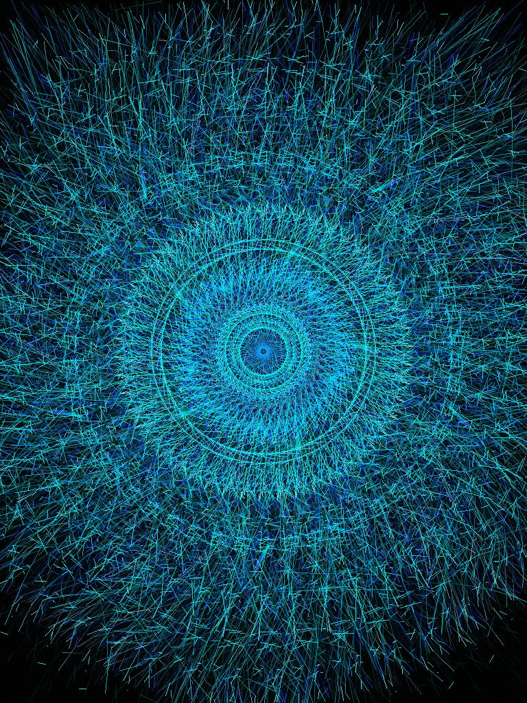
How about setting the wc pencil? I tried ironing it, which didn't seem to do anything much. A wet tissue dabbed onto the pencil work is an easy test of whether the pigment is set or not. Painting on thinned acrylic gel, textile medium, or Jacquard colorless extender (tutorial with wax pencils here) probably would have worked but since quite a bit of the image was involved, there was too much territory to cover. Instead, it was sprayed with two coats of Claybord matte fixative. This is the main fixative I use, because it has a relatively low odor that dissipates quickly. As you can see from the eye detail at the top of this post, there was another whole layer of stitching to add, so I didn’t want pigment from the pencils to get all over the threads or have to keep smelling a noxious odor. The other advantage is that is doesn’t stiffen the fabric much, if at all.

The watercolor pencils gave me the soft look I wanted, so that was the main thing. Wondering what this animal is? If it doesn’t get into the calendar, I’ll reveal all in a couple of months. If it does get in, I’ll post more about this project closer to the calendar’s release date.

Happy New Year, everyone!