After glue-basting the patches down and cutting out the wolf, I tried some possible background fabrics. The idea was to vaguely suggest a landscape while keeping it very simple. I considered introducing some subdued greens, but they looked hideous, so forget that!
The above colors were pretty good, but overall it was too blah. The fabrics below were almost what the artist ordered, but the gray “mountain range” seemed too similar to the wolf’s underlying fur color. I also fixed his mouth...above it looks like he has an overbite and his lower jaw was too rigid, so below it’s a tad more wrinkled.
So, after some free-motion machine stitching and a fabric binding, here’s how he turned out:
I’m pretty happy with this piece, all things considered. There were some glitches with the eye... next time I’ll probably paint the entire eye instead of fooling with teensy pieces of fabric. I’m not crazy about this “typical” binding and need to come up with a more interesting option. Maybe painting a more irregular “frame” that is rigid because of the acrylic paint and stitching it on would do the trick. (Will have to try that idea, probably doesn’t make too much sense!)
Last but not least, any ideas for a title? Other than Ta-dah, that is.
Friday, May 28, 2010
Wednesday, May 26, 2010
Wild times in the studio
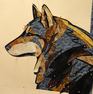
Recently, I was working on a writing project that involved describing how it feels to be a wolf, so that seems to be what inspired this project. After working out a sketch of a profile of canis lupus, I transferred it to a grayish blue fabric with some texture. The lines are painted with black gesso to get a matte finish. The photo below makes the gray look neutral, but it’s fairly blue as seen above.
The fabric is pinned to 1/2 inch thick foam core, by the way. It makes a wonderful portable work surface that can be put on an easel, laid flat, pinned up on the design wall, whatever. I put a paper cutout around the silhouette of the wolf because the plan was for the background to be a light value. Then I started pinning on patches of fabric in somewhat realistic, but intensified colors.
Some of these fabrics had to be switched out later, but the only way to know is to try them out. One of the big questions was how much of the line work to cover up vs. cutting the patches so that it showed. I tried not to get too hung up on it. The first black fabric I tried was too busy, but this one has just a suggestion of dark gray swishes, which worked well.
The finished piece will be in my next post, hope you like him so far.
Monday, May 10, 2010
I'm a calendar girl (again!)
Just heard that my entry for the Quilting Arts 2011 calendar won... yahoo! Here are all the winning entries. Below is a detail from Garden Fresh, not sure which month it will be yet.
It’s been fun to enter this contest. The first time I tried, my entry Studio View didn’t get anywhere, but it came in handy as the header for my blog. I can see now why it probably didn’t get in. It had some nice parts, such as the cat or this squirrel:
It’s been fun to enter this contest. The first time I tried, my entry Studio View didn’t get anywhere, but it came in handy as the header for my blog. I can see now why it probably didn’t get in. It had some nice parts, such as the cat or this squirrel:
But overall, it‘s a little murky, not enough contrast. For example, the red cardinal disappears into the rust-colored “pine needles.”
And what is that green blob between the squirrel and the birdhouse feeder?
Subscribe to:
Comments (Atom)


