This was a timely idea for me, since I had been thinking of showing some photos of my quilting lair anyway, including the design wall and storage solutions that have worked for me. The question is, do I tidy it up first or not?
Tuesday, September 29, 2009
Open Studios coming on Saturday!
This is a fun idea from Quilting Arts magazine... their Fall Studios issue features tips for hosting an open house in your studio. In conjunction with this theme, they’re sponsoring a virtual tour of studios on blogs, including this one. I’ll post photos of my sewing room on Saturday, October 3rd. If you’d like to participate, click here. It’s easy to do.
Monday, September 28, 2009
Top #2 on the design wall
To make it easier to arrange the pieces for this second quilt top from the estate sale fabric, I decided to clear all the “stuff” off of my design wall and actually use it for its intended purpose. Here is a close-up of some of the fabrics in this batch. Love the Eiffel tower prints!
Below is the entire top. I don’t know about you, but it looks to me as if those purple dots aren’t fitting in very well. Can you say “sore thumb?” There is enough fabric to insert something else instead. The other option in this kind of situation is to cut up the purple dots into smaller pieces and have it appear more than once, but I doubt that would work in this case.
This basic arrangement of big chunks is similar to top #1, but using the design wall instead of winging it is definitely making it easier already.
Happy Monday!
Tuesday, September 22, 2009
1st estate sale fabric top completed!
Do you remember the estate sale fabric I was fortunate enough to to find? It was already cut into medium-sized pieces and I was going to chop it up even smaller. However, since this is for a utilitarian project (a lap quilt) it seemed unnecessary. Besides, the prospect of lil ol‘ me sewing together four sets of fabric into quilts is chancy enough, so why make it that much harder? Below is a close up of some of the diverse fabrics.
Below is the whole top. While I did have to iron and straighten out the various pieces, I didn’t chop them up much at all. Because they‘re big prints, the pieces couldn’t have been much smaller anyway. If you look at the smallest pieces on the right side, they start to look a little muddled. But maybe that’s due to what’s next to them. I did put the prints with the dark brown backgrounds next to lighter pieces, mostly. Hey, whatever, this isn’t trying to be a masterpiece.
Another detail. The next step is to figure out the quilting. I’ll probably stitch in the ditch, then do large geometric shapes like zig-zags, wiggles, and in some areas follow the design.
My only complaint is that someone had the bright idea of spraying some perfumed stuff on the fabrics, which billows up when they’re ironed. Hate that stuff.
Anyway, one top done, on to the next one. By the way, I have never actually made a utilitarian quilt before, only wall hangings(!)
Friday, September 18, 2009
Do you want greener books?
Have you ever wondered which is better for the environment: paper books or electronic books? I dug through some articles to see if there was an answer to that question and posted the results on I.N.K. (Interesting Nonfiction for Kids.) It’s amazing how many factors there are to consider, and I.N.K. readers have added a few more.
In other I.N.K. news, the 20+ author-bloggers been compiling a database of all our books in terms of how they meet national educational standards. For example, Crazy Like a Fox: A Simile Story helps students to meet several standards developed by the NCTE (National Council of Teachers of English) such as NL-ENG.K-12.4: Communication Skills. The database will be a free resource for librarians, teachers, and parents who prefer to use high quality trade books but also need to justify their educational value. It’s due for launch in October with its own web site so more details will be coming soon!
By the way, here’s what’s going on in the illustration above... Rufus the fox has just woken up and feels “as fresh as a daisy.” During the story, whenever a character is compared to something he or she turns into that thing. Since various characters “shake like a leaf,” become “as mad as a hornet,” and get “as cold as ice,” they look pretty silly throughout.
Thursday, September 10, 2009
Love the new Illustrator blob brush
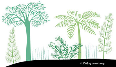
That is how these plants and the beastie below were drawn. There’s something ironic about using such a 21st century tool to draw prehistoric life.... I’ve never used Illustrator that much despite having it for at least a decade, but it seems the time has come. Photoshop, for all its wonderfulness, just can’t make lines this crisp. Illustrator brushes have an adjustable “smoothing” option that (surprise) smoothes out the wobbles and bobbles in each stroke. I keep the level pretty low and have to redraw some lines, but overall it works wonderfully well to create attractive, swooping line work. You also can make the size vary according to the pressure, and several other parameters.
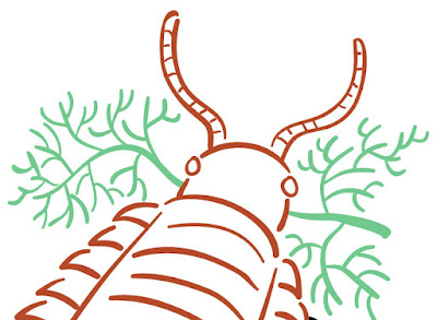
What’s helpful about the blob brush is that it automatically merges all lines that overlap and are the same color. Saves some steps. When you don’t want the lines to combine, the regular brush is the one to use. One problem I ran into that took awhile to figure out... once you’ve used the blob brush, if you switch back to the regular brush, it won’t work. Instead of the cursor, it shows a circle with the slash through it. You have to open the brush panel and choose a brush tip, then it works again. There may be some other way to avoid this, but whatever works, right?
Next step is filling in and otherwise coloring these in Photoshop.
Subscribe to:
Posts (Atom)