
I’ve been working for eons on a children’s book about prehistoric life. Okay, for months and months. The dummy is finally more or less finished after some major revisions, so great... we’ll show it to a paleontologist to avoid any boneheaded errors, then on to the art. Speaking of errors, it’s difficult when the reference books don’t agree on basic terminology. Eohippus? Hyracotherium? Protorohippus? C‘mon guys, the little horses are important, let’s stick to one name already. This is as bad as the whole Pluto-isn’t-a-planet thing. (Just kidding, I’m aware that naming organisms can get complicated.)
Anyway, the first art sample is below, a Tiktaalik trying to decide whether it’s worth the struggle to flop around on land to go after some creepy-crawlies. Or maybe he’s just gazing wistfully and resolving to sign up for some legs.
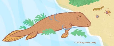
(Hmmm... a mysterious line has appeared on the two images below... just ignore it, please. I would redo the images, but have managed to lose one version due to one of those “Save As“ snafus.)
I’ve been thinking that the above style is okay but not that dynamic. So below is a stegosaur (Kentrosaurus) rendered with a bolder black line. Better? Worse? Either is okay?
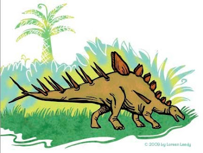
Of course, the fabulous thing about Photoshop is the ability to play with different color schemes, thus using up the time saved (if any) by using digital media. Either color version looks pretty good to me. I'm going to try having more black laced through the entire image to see how that looks. This is just a part of a page, maybe a third of it.
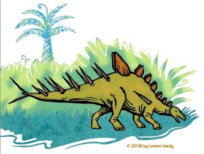
All of the line art and the plant shapes were done in Illustrator with the blob brush. This previous post goes into detail about the blob brush. Then the paths were pasted into Photoshop, filled, colored, and textured. BTW, the texture in the grass is from a photo of reindeer moss. Wonder if reindeer moss had evolved by the Jurassic Period? Or grass for that matter? I do know the reindeer hadn’t!

2 comments:
een,
I prefer the bottom two with the darker line. I particularly like how you have drawn back in to the background with a lighter colored line and love the reindeer moss texture. I wanted to look closer at the images but clicking on them did not bring up a larger image. I am really interested in trying out the blob brush now!
While I like all of these, I gravitate toward the bolder look of the bottom two.
I love the advantage of making different versions of my work in Photoshop, too. A person could just happily tweak through the options forever!
Post a Comment