Thursday, December 31, 2009

The 4 tops are finally quilts!

It took until late on Christmas Eve night, but I got them all finished in time. Here is a link to the previous posts that show the process of designing these. In case this is the first post you’ve read, the fabric for all four tops came in a box from an estate sale. These are the first “real” (as in functional) quilts that I’ve made. They’re lap size, about 4.5' X 6' or so. Without further ado, here is Anna with her new quilt and pillow with the fashionable ladies prancing around on the fabrics.These were a surprise for my nieces and nephew, which was fun. I almost had to give one of them held together with safety pins because time was running short. Below is Deborah with the mostly pink and white one.

That is Sarah with the groovy pink, green, and orange designs. I hear that it has instantly become her close companion for TV watching.

That reminds me, I just read a story in Consumer Reports that the “Snuggie” blankets shed handfuls of fuzz with every wash and end up threadbare. Another advantage of quilts.


Caleb’s quilt has guitars, too, plus musical notes on the backing fabric and keyboards on the binding. (He plays the cello.) This photo turned out a tad blurry, but you can see it better in the next
photo.


My husband Andy somehow took a nap amidst the cacophony of the group simultaneously playing the card game Flux and working a puzzle.

After making these simple designs with big chunks of fabric which still took quite a long time, I can’t imagine how people make the really complex blocks with a bunch of tiny pieces. More power to them, it’s back to small wall hangings for me!


Happy New Year, everyone!

Thursday, December 17, 2009

My “fresh picked” calendar quilt came home

And it looks as yummy as ever. It has certainly traveled more than I have this year as one of the Quilting Arts 2010 contest winners. It has been at trade shows and appeared in quite a few ads in magazines and arrived back here in perfect condition. Thanks, Quilting Arts! The calendars are still available for the reduced price of $9.99 at the Interweave store. The July image is my Handpicked.
The theme for 2011 is “Flavor of the Month.” Yes, that means food, food, food! So, if you feel like quilting some comestibles, by all means enter. Here is the info, you just have to scroll down the page a little.

To see previous related posts, click here.

Friday, December 11, 2009

Recoloring a stegosaur

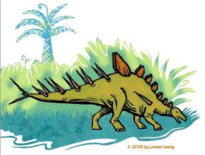
Here are three more versions of the Kentrosaurus from yesterday’s post. I got some very helpful feedback from my colleagues at PBAA (Picture Book Artists Association), so here goes. First I did a little tail surgery, then altered his body color only, below.
Below, his outline is a dark purple color. For some reason the background colors are brighter, too. Or are they just duller above... who’s in charge here, anyway?!?
Below the line work is a brown. It doesn’t look that different from the purple, really.
The brown/purple lines seem more integrated into the overall image, the black line stands out more... not sure which version I like, actually.

Thursday, December 10, 2009

Prehistoric illustration style... opinions needed!

I’ve been working for eons on a children’s book about prehistoric life. Okay, for months and months. The dummy is finally more or less finished after some major revisions, so great... we’ll show it to a paleontologist to avoid any boneheaded errors, then on to the art. Speaking of errors, it’s difficult when the reference books don’t agree on basic terminology. Eohippus? Hyracotherium? Protorohippus? C‘mon guys, the little horses are important, let’s stick to one name already. This is as bad as the whole Pluto-isn’t-a-planet thing. (Just kidding, I’m aware that naming organisms can get complicated.)

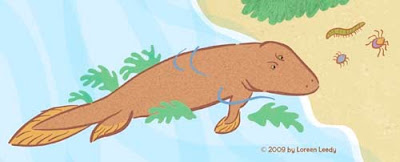
Anyway, the first art sample is below, a Tiktaalik trying to decide whether it’s worth the struggle to flop around on land to go after some creepy-crawlies. Or maybe he’s just gazing wistfully and resolving to sign up for some legs.
(Hmmm... a mysterious line has appeared on the two images below... just ignore it, please. I would redo the images, but have managed to lose one version due to one of those “Save As“ snafus.)

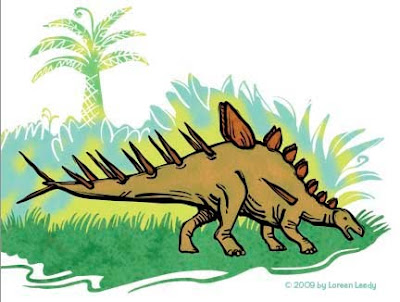
I’ve been thinking that the above style is okay but not that dynamic. So below is a stegosaur (Kentrosaurus) rendered with a bolder black line. Better? Worse? Either is okay?
Of course, the fabulous thing about Photoshop is the ability to play with different color schemes, thus using up the time saved (if any) by using digital media. Either color version looks pretty good to me. I'm going to try having more black laced through the entire image to see how that looks. This is just a part of a page, maybe a third of it.
All of the line art and the plant shapes were done in Illustrator with the blob brush. This previous post goes into detail about the blob brush. Then the paths were pasted into Photoshop, filled, colored, and textured. BTW, the texture in the grass is from a photo of reindeer moss. Wonder if reindeer moss had evolved by the Jurassic Period? Or grass for that matter? I do know the reindeer hadn’t!

Friday, December 4, 2009

My inspiration book

Like many artists, I keep images for reference and creative stimulation. One way of doing it is to keep a clip file, which consists of tossing the photos, drawings, etc. into a file folder. Though that works for some very specific projects, for my general collection of mostly catalog and magazine images, a more organized arrangement is more, well... inspiring!

A large binder with page protectors is the basic book. The images are pasted on paper with a glue stick on both sides, then into the page protectors they go. The binder is divided into categories using standard tab dividers. Below are some pages from the Fabric section. While these are clothes, I‘m primarily interested in the color combinations and the patterning on the cloth.
There’s a Jewelry section and a separate Bead section. Every time I look at these, I want to make one.
There’s a Knit & Crochet section, Ceramics, 2-D Art, and several more categories. Hey, at least all these ridiculous catalogs they send me get some use! (I have cut down on the onslaught by registering with CatalogChoice.org, which has helped. It’s an endless battle, though.)
The book is getting pretty full, may have to subdivide. Of course there’s a whole digital clip file on my computer that is getting vaster by the day. Then there are the bookmarked web pages, the blog subscriptions, my bookshelves, the library books...

Friday, November 27, 2009

Organize embellishments on your design wall

Usually a design wall is for putting together a quilt top. I just finished stitching a few myself, The 4 Tops. However, I’m getting ready to work on the LIQ project, a series of small wall hangings. Since I won’t be needing the entire design wall for awhile, a section of it is going to become a storage station for threads, buttons, lace, trims, and whatever else needs to be handy yet out of the way. The stuff is hung on various sizes of pins, depending on how thick each item is.

Perhaps you have the same affliction that I do... out of sight, out of mind. If these goodies are ever going to be utilized, I have to be able to see them! Just having them arranged like this makes me want to get going on the next wall hanging. When I first did some hand embroidery as a kid, the threads ended up as a tangled mess in a box. Hmmm... it’s probably still around here somewhere...
A post that includes how the design wall was made is here. Another way to use this concept is to get a piece of 1/2 inch foam core. Michael’s and Sam Flax are two stores that carry it. You could use it as a small portable storage wall, though knocking it over would be a potential hazard.
Believe it or not, all the doodads shown above were jammed into this cutlery organizer (from Bed, Bath, and Beyond.) It was impossible to find anything as you can imagine. This is what’s left in there for the moment, though it’s sure to be filled up again soon.
I’d be interested in hearing about other interesting storage or organizing tips, heaven knows there are still stashes of stuff piled up that need a better home.

Wednesday, November 25, 2009

Spiced cranberry sauce... yum!

Ixnay on the cranberry sauce in a can, right? My husband Andy tasted this at a party a long time ago, and has been making it ever since.

Spiced Cranberry Sauce

4 cups fresh cranberries (2 standard-sized bags)
2 cups water
2 cups sugar
1 tsp cinnamon
1/2 tsp ground cloves
1/8 tsp ground ginger

Wash cranberries and drain. Combine rest of ingredients in a large pot, bring to a boil. Add cranberries, cook at medium heat for 7 to 10 minutes until the skins pop (see below.)
Mash the berries (below.) Reduce heat and simmer for 20-30 minutes with the lid on but askew to allow steam to escape. Stir occasionally until dark red and thickened.
Remove from heat, pour into glass or ceramic container, and chill.
Happy Thanksgiving!

Sunday, November 22, 2009

Top #4... last but not least!

These are the fabrics for the last of The 4 Tops. Do you agree with me that this group has a distinctly masculine vibe? The piece in the center left has tiny dots on black... it had too much visual vibration and looked muddy, so that fabric was deleted. Also, it seemed to me that more red and black would be beneficial to add more dark notes.
Fortunately, I had some red and black checked fabric plus some black with gold dots that fit in. (It’s somewhat amazing to me that despite having a ton of fabric, very little of my stash melds with this group.) Below is the first “draft” of the arrangement. Do you see any issues with it so far?
Maybe the black and white photo will make it clearer what bothered me with this design... the various rectangles were merging together too much, especially the lighter tones. I wanted more separation in the values.
Below is what it looks like pieced together. I didn’t have quite enough regular cotton fabric, so had to sneak in a couple of pieces of flannel on the edges. No biggie.
It has been interesting to work with such large pieces of fabric with large motifs, compared to the little scraps with more subdued patterns I usually am assembling. Oops, just noticed a glitch in the final top... the large guitar piece got vertically flipped with the piece below it. Hmmm... do I care enough to rip them out and restitch them?!?!

Tuesday, November 17, 2009

World Quilt Show in West Palm Beach

My husband Andy and I drove a couple of hours down to this new show last Saturday and it was definitely worth it. There were 400 quilts on display and some 80 vendors, a nice diversity on both counts. The West Palm convention center is very easy to get in and out of and is quite an attractive building. Plus it’s right across the road from City Place, a lovely collection of shops and restaurants. Another plus was that it wasn’t freezing inside from excessive air conditioning, so yay! My only complaint is that the lighting wasn’t the greatest, which is typical of so many similar venues.
On to the the quilts— these are a few of the many nice pieces that caught my eye. Below is Parasol by Liz Jones (United Kingdom). She must have visited Florida at some point, or do palmettos grow in many locations? I have no idea.
Here is a close-up of the wonderful free motion stitching.
Midsummer Melody is by Jane Rollason (United Kingdom).
Next is Little Bit of Sunshine, by Cynthia Wismann. This was part of an exhibit by Art Quilters Unlimited, a group based in Ft. Myers.
Here is a detail from Little Bit of Sunshine, which was whole cloth painted with fabric dyes (as well as some other techniques.)
Below is Morris in the Garden is by Sue Reich (Connecticut). The way the cat was depicted with outline stitching is what intrigued me about this one.
The Birder by Cheryl Costley is also part of the Art Quilters Unlimited exhibit. He’s wearing a real hat and his camera and binoculars are 3-dimensional. There weren’t very many depictions of people in the overall show, we noticed.
The next two photos are details from Down Under Florabunda by Margo Hardie (Australia). This quilt was just covered with beautiful birds and flowers. It must have taken ages to create.
To finish up the birding theme, here is a detail from Fantasy Flock by Sheena Norquay (United Kingdom). She used her own doodles as the design inspiration.
To prove that most quilt shows have something for everyone, here is a quilt that my husband Andy was enthused about. This detail of Leaves on the Ground by Helen Richards (Australia) shows leaves she drew on fabric from her photographs. My plant pathologist hubby got a kick out of the holes eaten by insects, galls, spots, and other evidence of apparent plant diseases.
There were quite a few nice quilts from Japan and other countries, too. The vendors were from all over the U.S... nice to see some new faces with interesting merchandise. Anyway, I hope you enjoyed seeing a small excerpt of this large show.


Sunday, November 15, 2009

Quilting Natural Florida 2

In the summer of 2006 we went to see the first Quilting Natural Florida show at the Museum of Natural History in Gainesville, Florida. Below is one of the pieces from that exhibit. What do you see in this image? I liked the abstract pattern of the diagonal shapes. The lighting was a little uneven, but after taking a photo, the little digital display showed what was hidden in plain sight.
The title will make it clear: Manatees by Faith Pflaz. There are three of them, facing left. For a nice slideshow with additional photos of the various pieces, click here. The exhibit was very enjoyable so I made a mental note to have something ready to enter for the next show. Alas, despite having loads of time, I didn’t have anything suitable when the entry deadline this fall loomed.
At the last minute, a tiny wall hanging of a pine tree that resulted from my plein aire painting workshop came to mind. It’s only about 7.5 inches by 10 inches, but it was accepted! At left is a detail from Reaching, a quilted painting of the gnarled top of a pine tree. I’ll put up the whole image closer to the show.

The 2010 show will have over 100 artworks in the exhibit, which will be on display from February 6 through April 25. If you’re in the area, by all means check it out. The butterfly atrium in the museum is wonderful, as well as the nice variety of Florida fossils. Love that terror bird! And of course, the giant ground sloth. Hey, maybe next time I could do an image of some prehistoric critters, that would be fun! (Guess I better get started ASAP.)