Showing posts with label techniques. Show all posts

Monday, August 17, 2015

Testing, testing...to further one's art

It's tempting to dive into art supplies and just start creating willy-nilly. And if that works for you, by all means do it. For me, it has often led to frustration and an awful feeling of utter failure...not to be melodramatic or anything. The sage advice to make value plans, color studies, technique samples, and so on has not been my usual procedure. Now that I'm back in art school (the home school variety) for the last few months, my studio contains a growing pile of test pieces. 

The general goal is to figure out a way to combine drawing, painting, and fabric to make artwork using reality as a jumping off point for improvisation.

Making color charts has been very useful. This one is for my stash of Neocolor 2  water-soluble wax crayons. Other media that can work with fabric with varying results include Inktense pencils, water soluble colored pencils, acrylic paints and inks, pastels, and so on.

Here are a bunch of samples...don't like most of these except the close up of the jaguar eye. One of the criteria beside my liking how something looks is was it fun to do? There's no point in coming up with an approach that is totally tedious, for example, given my attention span. Yet, I'm also not interested in something that looks like it took five minutes and demonstrates little skill.

Another batch, am liking these better. In general some samples utilize Lutradur (non-woven polyester), some are typical quilting cottons, also have experimented with paper laminated onto fabric. Some are collaged with acrylic gel onto panel, others are sewn together like a quilt. Re the quilted ones, I've decided the "puffy" look is not working so instead of cotton batting have tried felt, interfacing, and (my current favorite) flannel.

An important factor has been to be as open-minded as possible and question every assumption about what my art can/should be, what materials to use, and what form will it take. I've made a lot of progress but as always am impatient to get on with it and just make art. 

There does happen to be a piece in progress that I'm excited about, so if it doesn't get permanently mired in the proverbial ugly phase, it will appear in this blog soon. Happy creating!

Sunday, November 9, 2014

Pumpkin Art Quilt Demo

© 2014 Loreen Leedy
While browsing for produce in my favorite store in early October, I rounded a corner and found heaps of bright orange pumpkins. It was a striking display and later I couldn't resist making one with fabric. In addition to using paint, the idea was to render the pumpkin without laboriously cutting fabric shapes to create the image...but how?

A orangy yellowy batik with leaves seemed like a good starting point. This is actually the reverse with some of the paint showing through but it gives the general idea. Some reference photos helped with making a same-size sketch on tracing paper. I lightly drew it on the fabric with a white chalk pencil (or possibly regular school chalk, can't recall.)

The scribbly pencil lines on the the right side of the sketch are where the darker values will go. 

Rectangular chunks of fabric were arranged either randomly or with some values placed with the light source from the upper left. The rectangles were glue-basted in place. Then the lines were painted with black acrylic using a pointed round brush. The acrylic bled a bit on some of the fabrics but it was in keeping with the casual look. 

In order to separate the pumpkin from the background, acrylic paint was applied. First the black lines were masked off with torn-edged paper tape. It's a low-tack white paper tape, no idea if it's still being sold (this stuff has been rattling around in my studio for YEARS.) In any case, it worked well to protect the line work. The paint was applied with a scrunched up piece of waxed paper, which gives a nice random texture. The pumpkin gained a cream-colored "glow" and a plum shadow. It looks good but another time I may skip that step.

With the mask removed, the emerging pumpkin requested a few more chunks of fabric. The edge of striped fabric at the bottom was tinted orange and the stem got some brown lines. Love the stripes. Stripes make me happy!

It's always helpful to desaturate a photo to look at the art in grayscale to determine if there is enough contrast. Looked good to me.

Batting and a backing were pinned to the top for the quilting stage. In order to preserve the irregular blocky edges, the stitches stop about a half inch from the edges. The stitching consists of free-motion straight and zigzag stitches, mostly. I haven't decided how to mount this yet...on a stretched canvas? On a plain quilted support?

The balance of realism and abstraction works as I had hoped in this piece, which is nice. One minor complaint is that the style of the line work is somewhat old-fashioned...perhaps "retro" is a more positive way to look at it. Being hypercritical of lines is an occupational hazard of being an illustrator, alas. Also, the bluish chunks look a little out of place. There are some blue tones in the thread but from a distance that doesn't show. Then again, maybe it would be boring without the blue. If I really wanted to it would be fairly easy to cover up the blue with different fabric, but it's not bothering me enough at this point.
© 2014 Loreen Leedy
So that's the story of this pumpkin, hope you enjoyed it!

Loreen


Monday, October 27, 2014

Fruit Frieze Art Quilt, Step-by-Step

This space above the kitchen windows has been calling for artwork ever since we moved here...has it really been almost 11 years?!?

The vintage 70s-era stained glass chandelier provided the fruit theme so next I made a sketch
The fruit is big and cropped along the top and bottom to fill the art with a variety of colors. The original concept was to make several individual pieces mounted on canvas. After thinking about it, one wide, continuous banner made more sense. I taped together pieces of tracing paper along a long hallway and drew the fruit freehand.

Next the background pieces in medium and light tones of cyan blues were overlapped about a 1/4 inch and sewed onto the batting and backing. All of the fabric except the binding is left raw-edged, by the way. I transferred the tracing paper sketch using white Saral paper and blue removable pen, then painted the black outlines with acrylic paint. Painting directly is a tad nerve-wracking, as you can imagine. Then I washed on the basic colors of the fruit, often thin enough to allow some of the blue background fabrics to come through.
Because the piece was so wide (over 8 feet), it had to be rolled up and worked on in segments, starting on the left edge. There actually is a countertop in the room that would have been long enough but for reasons that escape me now, I didn't use it. Too much clutter, no doubt.

This middle section shows the red apple, bananas, and a peek of the strawberries after being painted then additional fabric added. To keep the fabric pieces in place I use thin basting glue, not fusible. Fusible is good on occasion but can be overkill and kind of a pain, what with the accidental ironing on the wrong side, etc.

Here is the apple close up. Hope these photos are okay...they were taken with my iPad, which is not very high-res. Some machine quilting is visible plus some hand-stitching with perle cotton.

The binding is made with various black on black fabrics. It was tough to photograph the whole frieze in place because of the lighting but this should give a reasonable idea. The vivid colors are a big improvement for the decor. The quilt has two sleeves on back with a break in the middle to leave space for a third nail. I used a piece of wood molding for hanging but it's not quite thin enough and causes a minor bulge. The plan is to replace the wood with aluminum bars which have been sitting in the garage for a month or two or three...

Here's another, rather extreme angle.

I'm happy with it and particularly like the plaid and checked fabrics. One thing that slipped my mind was the shrinkage caused by machine quilting. The width is about a half inch less on each end than I had planned, but nobody would know that. Except you, so please don't tell.

Some of my longtime readers may have wondered what happened to me since there have been no posts on this blog for three years. The main reason has been too many things to do and not enough time and energy to keep up with everything. So no worries, and I hope your artistic endeavors are going well. 

If you have any fruit-themed art you'd like to share, please feel free to post a link in the comments.

Loreen


Saturday, January 8, 2011

Watercolor pencils on fabric

My first completed project this year is for the 2012 Quilting Arts Calendar... might as well try for three years in a row! The theme is Feeling Pet-ty, in other words animals, a lifelong favorite subject of mine. The previous entries had fairly bright colors but the subject this time called for a much more subdued palette. I had not used watercolor pencils on fabric before, but because they are transparent and the idea was to allow the patterning on the fabric to show through, wc pencils had potential.
First, a little organizing was in order. These pencils date from a book project eons ago and were scattered about in various nooks and crannies of my studio. After corraling them into a semblance of order, a coloring chart became essential because of the nature of wc pencils. It’s very hard to tell just looking at the pencil what color it really is.
As you can see on the left, the colors change drastically when water is added.

Because I was not going to use plain white fabric, the pencils would be interacting with the underlying color and/or pattern. The fabric needed to represent the fur of my critter, without getting literal, necessarily. Below are the four contenders:
The one on the left was a possibility, the next one was too spotty, the next one too contrasty... the one on the right with it’s pattern of leafy, woodsy imagery seemed most promising. So, I scribbled on some colors (below) and brushed over them over with water. So good so far, time to jump right in.
The sketch was done in Photoshop, won’t get into the details of that now. Once it was printed out, I redrew it onto tracing paper. Someone had asked me awhile ago about my unusual method of transferring sketches, so here are some photos. The tracing paper sketch is on top, and I just draw directly on the fabric underneath. The pencil point is visible through the tracing paper.
I roll back the tracing paper often to see how it’s looking.
Also, it’s easy to see through the tracing paper where the pencil is because it is darker.
This method isn’t suitable in every situation, but because I was using a dark wc pencil and a thick line, it worked fine. Why not use transfer paper such as Saral? I do on many occasions, but this works just as well for me and there are no worries about a Saral line ending up in the wrong place and being tough to remove. How about a light box? That’s a good option if the base material is see-through enough. But, if you’re transferring a sketch to primed canvas (for example), a light box won’t work.

Below is the colored line before and after being washed over with water. Quite a difference! You can always add additional layers of the pencil, if needed, after the fabric is dry. Or, you can use the pencil on wet fabric, which really lays down pigment but may be a tad less controlled. By the way, in this case the amount of water being added is just sufficient to melt the wc pencil, not saturate the surrounding area.
How about setting the wc pencil? I tried ironing it, which didn't seem to do anything much. A wet tissue dabbed onto the pencil work is an easy test of whether the pigment is set or not. Painting on thinned acrylic gel, textile medium, or Jacquard colorless extender (tutorial with wax pencils here) probably would have worked but since quite a bit of the image was involved, there was too much territory to cover. Instead, it was sprayed with two coats of Claybord matte fixative. This is the main fixative I use, because it has a relatively low odor that dissipates quickly. As you can see from the eye detail at the top of this post, there was another whole layer of stitching to add, so I didn’t want pigment from the pencils to get all over the threads or have to keep smelling a noxious odor. The other advantage is that is doesn’t stiffen the fabric much, if at all.

The watercolor pencils gave me the soft look I wanted, so that was the main thing. Wondering what this animal is? If it doesn’t get into the calendar, I’ll reveal all in a couple of months. If it does get in, I’ll post more about this project closer to the calendar’s release date.

Happy New Year, everyone!


Wednesday, October 13, 2010

Pine in progress

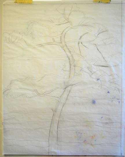
I’ve been wanting to depict this pine tree on our street for a long time, so it’s nice to finally get going on it. The photo is a nice start but I’m going to leave out the distracting trees behind it and tweak the colors. 

Here is the sketch on tracing paper, not too detailed but gets the idea across:
I started with a plain piece of some generic white cotton fabric, then globbed a lot of acrylic paint onto a silicone-treated sheet, one of the ones made for ironing appliqué. I folded over the sheet a few times, added more paint, etc. then laid the white fabric on it and pressed down.
This is interesting, but is too dark and contrasty, so the next step (after letting it dry thoroughly) was to brush over some lighter, semi-opaque paint. I also added some metallic copper paint. This is more like it:
Here is a close-up of the painted background:
Acrylic gel was used to adhere the fabric to a stretched canvas, then it was allowed to dry. (Note: if I was going to go in a more quilty direction, I would skip that step.) Next I transferred the sketch by using my weird method of taping the sketch over the canvas and drawing underneath it onto the canvas with a watercolor pencil. Next, the outlines of the tree were painted on:
I plan to paint in some color then use a few if the collage papers shown in this post to complete the tree. But, we’ll see what actually happens!


Friday, July 9, 2010

Still looking into the treetops

Here is another experiment with the oak branches as a subject using “hard” collage, as opposed to soft quilting techniques...there are so many possible options it’s pretty amazing. Below is the reference photo, taken on Big Talbot Island in north Florida:
The spiraling branches are what caught my eye in the park and inspired this piece. The large broken off branch in the lower right didn’t seem to add anything, so I left it out of the composition.
I’m not crazy about the texture of canvas, so some torn pieces of handmade paper were collaged onto the bare canvas to cover some of it. I sketched in the branches using watercolor pencils and painted in the basic structure with Golden OPEN acrylics. They’re nice to work with because they don’t dry on the palette/canvas as quickly as regular acrylics.
Blues, greens, and turquoises were painted on fairly quickly, just to cover up the white ground, primarily. Fortunately, I was liking it already, always a huge relief. Many, many pieces of torn paper and words ripped out of a defunct old book were added. The word “cathedral” in all caps (seen at the center bottom) inspired the name of this piece.
The words form a poem that can change, depending on the order in which you read them...


Cathedral
quiet woodlands
branches spreading to the sky
ageless strength
peace and restful calm
priceless beauty
cathedral


Thursday, September 10, 2009

Love the new Illustrator blob brush

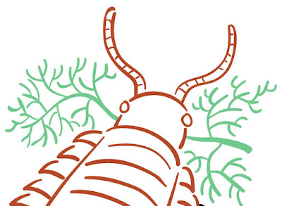
That is how these plants and the beastie below were drawn. There’s something ironic about using such a 21st century tool to draw prehistoric life.... I’ve never used Illustrator that much despite having it for at least a decade, but it seems the time has come. Photoshop, for all its wonderfulness, just can’t make lines this crisp. Illustrator brushes have an adjustable “smoothing” option that (surprise) smoothes out the wobbles and bobbles in each stroke. I keep the level pretty low and have to redraw some lines, but overall it works wonderfully well to create attractive, swooping line work. You also can make the size vary according to the pressure, and several other parameters.
What’s helpful about the blob brush is that it automatically merges all lines that overlap and are the same color. Saves some steps. When you don’t want the lines to combine, the regular brush is the one to use. One problem I ran into that took awhile to figure out... once you’ve used the blob brush, if you switch back to the regular brush, it won’t work. Instead of the cursor, it shows a circle with the slash through it. You have to open the brush panel and choose a brush tip, then it works again. There may be some other way to avoid this, but whatever works, right?

Next step is filling in and otherwise coloring these in Photoshop.

Monday, August 10, 2009

Wire jewelry set

It was intriguing to visit the CHA Craft SuperShow... mostly I was on the lookout for new materials or those that I’ve previously overlooked. One of the latter is WireLaceTM, which is a ribbonlike tube of extremely fine wire netting that comes in various widths and colors. It can be stretched into ruffled shapes if desired. Bello Modo has a good selection, as well as a lot of other beautiful beads, embellishments, and other tempting supplies. The photo on the left from their display shows the WireLace woven into large chains. Also check out the kits for finished examples.

I’ve been branching out from basic wire crochet as shown below. This necklace started with one simple chain in 28 gauge wire with a few beads added in. Then several strands of randomly swirled and beaded wire were woven in one by one. It’s not an exact process... the swirls are done around various sizes of crochet hook handles or a thick needle (for a very small coil), stretched, flattened, and/or twisted around, weaving in and out of the crocheted chain. The crocheted chain provides the structure for the other strands because it can’t be stretched out of shape. 
The teardrop earrings use the same wires along with the smaller beads used in the necklace.
This little sample didn’t end up as part of the set, but it has possibilities, don’t you think?
Happy Monday!