Showing posts with label Photoshop tip. Show all posts

Friday, April 1, 2011

A quick Adobe Illustrator Live Trace tutorial

My uber-talented artist friend Joyce Shelton asked me about using the Live Trace feature in Adobe Illustrator. Thought I knew how to do it... ummm... now I do! It allows you to convert a scanned drawing to vector lines. There are many advantages to vector art, one being that you can enlarge it basically infinitely without losing any resolution. So let’s use some of Joyce’s art to see how it’s done:

Her original was drawn with ink, but a pencil drawing is okay, too.

Scan art into Photoshop or similar program with 300 ppi resolution. The scan Joyce sent me was actually too low res, but it worked anyway.

If artwork is in pencil or otherwise lacking in contrast, use Levels to make it more black and white without losing too much detail. Save in psd, jpeg, or tiff format (others may work, but I haven’t checked them all.)

In Illustrator, open a new document and use File> Place to get the pixel artwork in there. If for some reason that doesn’t work, use Select All, then Copy (in Photoshop) and Paste into Illustrator.

Use the black arrow tool to select the artwork if it isn’t already. Go to Object> Live Trace > Options and a dialog box will open.

Put a check in the Preview box (on the right side in CS4, anyway). Tweak the various controls while looking at the image, which will update as you change the settings. Here are the settings I used:

To look at the original artwork again for comparison, uncheck the Preview box, then check it again if you want to make more adjustments.

Note that the Ignore White box is checked. This way you don't get all the white paper turned into shapes, which are a royal pain to get rid of.


Once you get the settings the way you want them, you can save as a Preset to use it every time, if desired. Even so, you might have to tweak the settings for each drawing.

Click on Trace and dialog box will close. Go to Object> Expand and the artwork is now all converted to paths. If desired, you can adjust the lines with the various tools in Illustrator.

By default, the black lines are all Grouped so when you select a part with the black arrow, the whole thing is selected.

Copy and Paste into Photoshop. Select Paste as Pixels then hit Return to complete the Paste. If desired, add color in Photoshop.


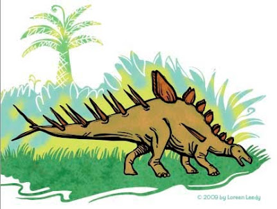
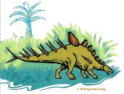
The image shows a detail of the converted artwork, with yellow behind it so you can see the white is gone. It doesn’t give an exact copy of the original line work, but it looks pretty good, and is much, much faster than trying to draw similar artwork from scratch in Illustrator.

Hope this makes sense, let me know if you have any questions. Happy Live Tracing!

Tuesday, April 6, 2010

Color improvisations in Photoshop

I like to start with reality then alter it a little or a lot. In digging through my Photoshop how-to books, it seems that I’ve neglected some fun ways to play around with color. This post on Gloria Hansen‘s blog has a photo of boats that she altered that really appeals to me (scroll all the way to the bottom to see her results.)
My hubby Andy and I have been hiking quite a bit lately, enjoying the lovely spring weather and fresh green leaves. Though I shoot quite a few photos, somehow they don't capture the vision in my mind’s eye. This typical image was taken on the oak hammock trail at the Merritt Island National Wildlife Refuge. I like the shape of the twisty oaks, but the color is pretty ho-hum. Photoshop to the rescue!


You may be interested to know how this was done... it’s impossible to give a step-by-step formula because each image has its own issues. Basically I added a Hue/Saturation Adjustment Layer to every image, then tweaked individual colors if needed. A filter was run on a copy of the image (it’s always nice to have the original underneath to refer to), either Paint Daubs or Palette Knife. Or try the Surface Blur or Smart Blur. 


All of these have a Curves Adjustment Layer and possibly a Channel Mixer and/or Brightness/Contrast, too. Since they're Adjustment Layers, you can continue to tweak them until you’re happy. 


You also can combine the best of two Layers by masking out part of one. It sounds harder than it is once you’ve memorized that little procedure.


Here are a couple more:

Whether I’ll use these images as inspiration to throw some paint and/or fabric around is hard to say...I definitely find them much more compelling this way.

Sunday, March 14, 2010

Shooting and adjusting excellent detail photographs

I just read a post on the Beadlust blog by Robin Atkins, Taking and Editing Quality Photos of Beads and Beadwork... it’s an excellent tutorial that would be useful for many types of artwork. It includes the adjustments she uses in Photoshop, including Levels, Shadow/Highlight, Brightness/Contrast, and several more. A before and after image shows how much of a difference her process makes in bringing out the beauty of her beadwork. I certainly learned a thing or two that will come in handy. 
While you’re there, of course, check out the fab artwork made with one of my favorite materials, BEADS! I haven’t posted many of my beaded creations, but above is a butterfly that’s almost finished. He just needs a little repair work where I managed to cut the thread around the outside... oops! This actually was scanned, not photographed... it doesn’t look as sparkly as the real thing, but since I was in a hurry and didn’t follow all of Robin’s steps, that’s probably why.


Thursday, January 21, 2010

A “value-able” Photoshop tip


Checking the values of artwork as you work allows you to disregard color for a moment and evaluate the pattern of light and dark. Transforming the view of an image into black and white is very easy in Photoshop, using a Black and White adjustment layer. 


Many thanks to David Opie (www.spacemandave.com) for this simple but very useful tip.


Select the topmost layer in your document, then create a new layer thusly: go to Layer> New Adjustment Layer> Black and White and poof, the entire image is in grays (though none of the layers below are actually changed.) How does it look now... flat or contrasty, too much dark in one area, too uniform, or whatever? In the case of this Allosaurus on the left, he’s as flat as a pancake and needs some shading and highlighting.


That’s better, isn’t it? The way I’ve been doing the modeling lately is to make one layer for highlights set in Screen mode, then a layer for shading set in Multiply mode, both clipped to the color layer. The same color can usually be used on both layers but because of the different modes, it has a completely different effect. I‘m still not happy with his teeth because they don’t look sharp enough, but that’s a problem for another day! 


Here he is with the Black and White adjustment layer in place. From now on, I’m going to put a B + W layer on top of every image and use it to punch up my artwork. You can turn it off and on by clicking on the eyeball.

I’m still slogging away at these prehistoric illustrations... hope to finish before the next asteroid strikes!


Thursday, December 10, 2009

Prehistoric illustration style... opinions needed!

I’ve been working for eons on a children’s book about prehistoric life. Okay, for months and months. The dummy is finally more or less finished after some major revisions, so great... we’ll show it to a paleontologist to avoid any boneheaded errors, then on to the art. Speaking of errors, it’s difficult when the reference books don’t agree on basic terminology. Eohippus? Hyracotherium? Protorohippus? C‘mon guys, the little horses are important, let’s stick to one name already. This is as bad as the whole Pluto-isn’t-a-planet thing. (Just kidding, I’m aware that naming organisms can get complicated.)

Anyway, the first art sample is below, a Tiktaalik trying to decide whether it’s worth the struggle to flop around on land to go after some creepy-crawlies. Or maybe he’s just gazing wistfully and resolving to sign up for some legs.
(Hmmm... a mysterious line has appeared on the two images below... just ignore it, please. I would redo the images, but have managed to lose one version due to one of those “Save As“ snafus.)

I’ve been thinking that the above style is okay but not that dynamic. So below is a stegosaur (Kentrosaurus) rendered with a bolder black line. Better? Worse? Either is okay?
Of course, the fabulous thing about Photoshop is the ability to play with different color schemes, thus using up the time saved (if any) by using digital media. Either color version looks pretty good to me. I'm going to try having more black laced through the entire image to see how that looks. This is just a part of a page, maybe a third of it.
All of the line art and the plant shapes were done in Illustrator with the blob brush. This previous post goes into detail about the blob brush. Then the paths were pasted into Photoshop, filled, colored, and textured. BTW, the texture in the grass is from a photo of reindeer moss. Wonder if reindeer moss had evolved by the Jurassic Period? Or grass for that matter? I do know the reindeer hadn’t!

Sunday, November 1, 2009

6 quick digital art tips

Here are a few fairly random tips in no particular order along with the corresponding Photoshop commands, though similar functions can be found in many art programs.

1) Reverse the image you’re working on to look for lines/shapes/colors that look “wrong.”
Edit> Transform> Flip Horizontal.
Work on it for awhile, then flip it back.

2) Learn keyboard shortcuts. I put them on sticky notes on my monitor until they’re sufficiently tattooed on my brain. The very first ones I learned? Cut (command X) and Paste (command V).

3) Put image into grayscale to check values.
Image> Adjustments> Desaturate or keyboard shortcut Shift-Command-U.
Does it still read well or does it turn into mush?

4) Record an Action for anything you do repeatedly that doesn’t already have a keyboard shortcut. I’ve made actions for Flipping Vertical or Horizontal, to Copy or Paste Layer styles, and now in CS4 to Link or Unlink layers (since it now is a hassle to do otherwise.) I need to record a few more Actions, actually.

5) Zoom out so the image is tiny... does it still look interesting?

6) Get ahold of a Photoshop how-to book or two, with plenty of pictures. I’m working my way through Photoshop CS4: The Missing Manual and am picking up plenty of good info. I ignore the stuff that doesn’t apply to my work flow, and put sticky notes on the pages with the real gems. Why buy a book? There are a lot of good tutorials, etc. on the web, but a book helps you to systematically cover all the basics of the program. There are many techniques that I use every day that I NEVER would’ve figured out on my own but found in a book. The WOW! series, which have even more pictures, are also excellent. There are many other good ones.

That’s it for now, just wanted to toss those out there. By the way, I upgraded from CS1, so am just now finding out about the Warp tool... love it!!! (Under the Edit> Transform menu.)

I changed my sig to have more autumn-like colors, though it’s still hot here in Florida (ugh!)

Friday, July 3, 2009

Repaint a barn in Photoshop

We recently visited Calloway Gardens in Georgia, and I spent a couple of mornings practicing my plein air painting. This little barn is in the vegetable garden area. The bright light hitting the lime green coleus plants caught my eye plus this vantage point was in the shade, so this was the spot. The photo below was taken very early before the light hit the front of the building. One of the tricky things about outdoor painting is that the light changes quickly. You can read my previous plein air posts here.After about 4 hours of painting over two mornings, this is what I was able to finish (below). I left off some of the more complex details of the building, but at least it’s fairly straight. It seems to have lost some of the width of the actual structure... oh well! Anyway, what bugs me about it at this point is the overall brown look between the taupe color of the barn and fence plus the reddish-brown mulch. Before putting more actual paint on this, I’m going to test some tweaks in Photoshop first. One way to change color is to select a section with the magic wand and use Hue/Saturation to try different colors. But today I’ll use the Replace Color feature. First I used the Lasso tool to make a loose selection around just the barn. Then under Image>Adjustments>Replace Color a dialog box will open up. Click in the image window to select the front of the barn. To add to the selection, hold down the Shift key. Slide the Fuzziness lever to increase or decrease the selection amount. Once the front of the barn was completely selected (it appears white in the preview window), I increased the Saturation and Lightness. Below the barn looks lighter and more yellow.The same procedure was used below to make the fence a light gray. Testing out color changes digitally like this can save time and paint! While this doesn’t look exactly like the actual barn now, the issue is making the painting look good. To me this has a better overall value and color harmony. The shadows on the mulch should probably be darker, actually. My favorite part is the trees.It’s fun to push an image even more by playing around with Curves instead, which posterizes it somewhat and inserts some odd colors. There’s no real consistent procedure to follow other than to go to Image>Adjustments>Curves and start drawing little bumps above and below the diagonal line, then see what happens. Give it a try, it’s fun to play with.Have a great 4th of July!

Tuesday, June 9, 2009

Tweaking a kitty in Photoshop

Let’s look at some more photo manipulation options in Photoshop. (For other posts along this line, just look on the right sidebar for Photoshop tip and click on that link.) I’ve always liked black and white animals so here is a photo taken during a garden tour we took recently. The graphic shadows had the potential to create an interesting composition. First it gets cropped, then made more contrasty with Levels (below.)Oops, that means you can’t see the edge any more because the sidewalk has been blown out. Oh well! Next (below) it’s been run through Filter>Artistic>Cutout with the settings Number of Levels 8; Edge Simplicity 0; Edge Fidelity 3.For a black and white look, let’s try Filter>Sketch>Photocopy with setting of Detail 3; Darkness 50 (below). This filter will use whatever foreground color is set, in this case it’s black.Another black and white one is Filter>Graphic Pen with the settings Stroke Length 15; Light and Dark Balance 41; Stroke Direction- Right Diagonal. Again, it will use the foreground color.For a nice blast of color, the photo below was tweaked with Image>Adjustments>Gradient Map, then you can choose which gradient to use. This one was already available in the 8 or 10 in the set. Each gradient looks very different, depending on which color replaces what.This is definitely a fun way to “sketch” without wasting any paper or paint.

Wednesday, April 22, 2009

Simplifying a Subject in Photoshop

A common objective in painting from life is to avoid getting hung up on the little details of the subject too soon (or at all). To further the discussion from my previous post, let’s see how we can use Photoshop to simplify a photograph. Below left is the original photo. It seemed a little dull, so I used Image> Adjustments> Levels to make it more contrasty (right.) The rest of these tweaks all started with the leveled photo.
Let’s posterize it to see how that looks, using Image> Adjustments> Posterize with 2 levels (below left) or 5 (below right.) Make sure the Preview box is checked to see how it’s looking while deciding which number to enter. The left image has become too distorted probably, but it’s interesting to see the darks go to black. The one on the right still has too much detail, methinks.
The experience of taking off my glasses to be able to see big shapes during the workshop gave me this idea. Below left has Filter> Gaussian Blur of 10 applied. That blurred image was then Posterized with 6 levels (below right.) That definitely gets rid of extraneous detail.Another excellent option is to use Filter> Artistic> Dry Brush (below.) The brush size was 10, the detail was 0, and the Texture was 1. If the preview image is too big, you can click on the - (minus) symbol on the lower left to reduce it. This does a nice job of smearing out the details. You can run the filter more than once if desired. It looks good to me as the amount of detail I’m interested in. To intensify the colors (right) I used Image> Adjustments> Hue/Saturation, with a +10 on Saturation. Of course, all this digital manipulation isn’t going to be possible if you’re painting outdoors. But if you also enjoy working from photographs in your studio, then...

Happy Tweaking!

Tuesday, April 14, 2009

Tracing an image with or without Photoshop

While getting ready for the plein air workshop last week, my friend Joyce showed me a wonderfully concise guide to the activity by artist Tom Brown. Originally created as a handout for his own workshops, he now sells it as a PDF online through his blog. His April 12th post gives the details of what it contains. One of the DIY tools he shows is how to make a simple “viewfinder” to trace the basic shapes and especially the perspective lines when painting outside.

First let’s try it in Photoshop. Here’s a not-very-sharp photo of our kitty Knickers lounging in the guest room. While she loves it when the futon is open, it does get in the way of my quilting activities.
In Photoshop, you simply make a layer on top of the photo and start drawing the lines with a hard round brush. To see how it’s going, turn off the photo layer (click the eyeball). As shown below, I’m not trying to painstakingly copy everything, just do a reasonably good job of capturing the important contours. It’s very easy to get the lines of the futon going in the right directions to create a convincing sense of space. I just noticed that the line of the floor meeting the wall is missing... oops!But what if you are somewhere without a computer? (Horrors!) The ideal thing is to develop the ability to look at a scene and put it on paper (i.e. learn how to draw from life.) But if you haven’t gotten around to developing that skill yet or are in a hurry, try this: get a piece of thin plexiglass at an art supply or hardware store (8" X 10" max) and a dry erase marker. Hold up the plexi, and start drawing. The drawing will be somewhat wobbly, but it still helps you turn the 3D scene in front of you into a two dimensional rendering. In case anyone thinks this is “cheating,” my response would be... so is buying paint in tubes instead of gathering rocks to grind into pigments. Or buying fabric instead of growing cotton and weaving your own. : )

As you can see below, Knickers had moved by this time. For some reason she is highly suspicious of many tools such as rulers, cameras, sheets of foam core, and heaven forbid, the ironing board. Anyway, what do you do with this scribble now, you ask? Use it as a stepping stone to create a drawing in your sketchbook, or if you’re plein air painting it’ll help you place the composition on the canvas, try alternatives, block in the main shapes, etc.
Rather than plexiglass, I actually used a lightweight sheet of styrene from a craft store, intended to make faux stained glass. It would add very little weight to an outdoor art kit, which is always an plus. It would be nice to add a 5-step gray scale, too. At the workshop I discovered that while drawing is not problem for me, mixing the right color AND value of paint was another story. More about that another time.

Friday, April 3, 2009

Finding a color scheme in a photograph

Deciding which colors to use in artwork can be daunting at times. One great idea is to use a photograph with color combinations that speak to you. The image below is a detail cropped from a larger image. The complete photo along with dozens more donated by fiber artists for the “Inspired by Photos” Photo Hunt are available here. By simplifying the image in Photoshop or a similar program, it can be easier to see the hues. The image below was created using Filter>Pixelate>Mosaic. In the dialog box, make sure the Preview box is checked so you can see a live preview. Try various cell sizes... below is 25.
Below is a cell size of 50.
Below is a setting of 75. Some colors are lost as the cell size gets larger. In particular, I would most likely put the black and near white back in.Of course, you don’t have to use the scheme as is. Below I chose Image>Adjustments>Variations, then clicked on More Yellow. What’s nice about Variations is you can see several options at once to gauge which is most appealing.
An advantage of this process is the chance to break away from one’s usual color choices. So, start rummaging through your photos to find interesting combinations to try in your artwork. Happy creating!

Monday, March 30, 2009

Cleaning up stray pixels in Photoshop

This is scanned artwork with the contrast exaggerated to make it easier to see the problem of stray pixels caused by paper texture, dust, etc.
How do you deal with this problem, especially when it’s hard to see where the pesky little unwanted pixels are? Usually when I'm working on an image in Photoshop, the stray pixels are less obvious, more like the image below:
What’s the big deal, anyway... who cares about a few stray pixels? In some cases they won’t matter, but when your image will be used as an illustration it’s amazing how often they turn into glaring blotches in the printed piece that really are bothersome. To find and eliminate them, read on.

This is line work that has been scanned in and lifted off the background white paper. This post explains how to do that.

I zoomed in to erase any visible pixels. But are there more lurking? To find out, add the Stroke Layer style to the lines layer. In the top menu bar, choose Layer>LayerStyle>Stroke. When the dialog box opens, use these settings (most are default):
Size- 3 to 5 pixels
Position- Outside
Blend Mode- Normal
Opacity- 100%
Fill type- Color (pick a bright contrasting color such as red)


Either the drawing suddenly contracted chicken pox, or the red stroke around every pixel shows that there are indeed many stray pixels. Select them with the Lasso tool and delete or use the Eraser tool to remove them.

These car images can be enlarged by clicking on them, by the way.

I don’t worry too much about a few blips near the line work, since they will blend in. It’s the glitches floating inches away that seem to show up most annoyingly in the printed book. Now that the art is cleaned up, time to finish coloring it in. Don’t forget to get rid of the Strokes Layer style. The easiest way is in the Layers palette, drag the Effects to the trash, the small icon on the lower right.

Here’s our little car, ready for his close-up. Wonder why he’s got a sail on top?