Showing posts with label illustration. Show all posts

Friday, April 1, 2011

A quick Adobe Illustrator Live Trace tutorial

My uber-talented artist friend Joyce Shelton asked me about using the Live Trace feature in Adobe Illustrator. Thought I knew how to do it... ummm... now I do! It allows you to convert a scanned drawing to vector lines. There are many advantages to vector art, one being that you can enlarge it basically infinitely without losing any resolution. So let’s use some of Joyce’s art to see how it’s done:

Her original was drawn with ink, but a pencil drawing is okay, too.

Scan art into Photoshop or similar program with 300 ppi resolution. The scan Joyce sent me was actually too low res, but it worked anyway.

If artwork is in pencil or otherwise lacking in contrast, use Levels to make it more black and white without losing too much detail. Save in psd, jpeg, or tiff format (others may work, but I haven’t checked them all.)

In Illustrator, open a new document and use File> Place to get the pixel artwork in there. If for some reason that doesn’t work, use Select All, then Copy (in Photoshop) and Paste into Illustrator.

Use the black arrow tool to select the artwork if it isn’t already. Go to Object> Live Trace > Options and a dialog box will open.

Put a check in the Preview box (on the right side in CS4, anyway). Tweak the various controls while looking at the image, which will update as you change the settings. Here are the settings I used:

To look at the original artwork again for comparison, uncheck the Preview box, then check it again if you want to make more adjustments.

Note that the Ignore White box is checked. This way you don't get all the white paper turned into shapes, which are a royal pain to get rid of.


Once you get the settings the way you want them, you can save as a Preset to use it every time, if desired. Even so, you might have to tweak the settings for each drawing.

Click on Trace and dialog box will close. Go to Object> Expand and the artwork is now all converted to paths. If desired, you can adjust the lines with the various tools in Illustrator.

By default, the black lines are all Grouped so when you select a part with the black arrow, the whole thing is selected.

Copy and Paste into Photoshop. Select Paste as Pixels then hit Return to complete the Paste. If desired, add color in Photoshop.


The image shows a detail of the converted artwork, with yellow behind it so you can see the white is gone. It doesn’t give an exact copy of the original line work, but it looks pretty good, and is much, much faster than trying to draw similar artwork from scratch in Illustrator.

Hope this makes sense, let me know if you have any questions. Happy Live Tracing!

Tuesday, February 9, 2010

Seen a Giganotosaurus lately?


There’s going to be one on the cover of the book I just finished. Yes, I made the deadline (barely), working until 10 o'clock at night without a day off since about the middle of December. 

Haven’t worked that hard since illustrating my first book in 1984 which was pen and ink with pre-separated color. That meant that I had to color in with pencil 4 black and white “plates” for each spread of artwork, one for each process color of Cyan, Magenta, Yellow, and Black. No wonder A Number of Dragons took 6 months to illustrate. 

Who knew then that a bunch of people out there would invent the computers, software, and electronic pens and tablets to allow artists to draw and paint digitally? One thing is for sure, the artwork shown above would not exist with those tools. When My Teacher is a Dinosaur is released next fall (hopefully), my buddy Giganotosaurus (Giggy for short) will be staring out from the cover. 

And now, on to reclaiming my normal life again... yay!

Thursday, January 21, 2010

A “value-able” Photoshop tip


Checking the values of artwork as you work allows you to disregard color for a moment and evaluate the pattern of light and dark. Transforming the view of an image into black and white is very easy in Photoshop, using a Black and White adjustment layer. 


Many thanks to David Opie (www.spacemandave.com) for this simple but very useful tip.


Select the topmost layer in your document, then create a new layer thusly: go to Layer> New Adjustment Layer> Black and White and poof, the entire image is in grays (though none of the layers below are actually changed.) How does it look now... flat or contrasty, too much dark in one area, too uniform, or whatever? In the case of this Allosaurus on the left, he’s as flat as a pancake and needs some shading and highlighting.


That’s better, isn’t it? The way I’ve been doing the modeling lately is to make one layer for highlights set in Screen mode, then a layer for shading set in Multiply mode, both clipped to the color layer. The same color can usually be used on both layers but because of the different modes, it has a completely different effect. I‘m still not happy with his teeth because they don’t look sharp enough, but that’s a problem for another day! 


Here he is with the Black and White adjustment layer in place. From now on, I’m going to put a B + W layer on top of every image and use it to punch up my artwork. You can turn it off and on by clicking on the eyeball.

I’m still slogging away at these prehistoric illustrations... hope to finish before the next asteroid strikes!


Friday, December 11, 2009

Recoloring a stegosaur

Here are three more versions of the Kentrosaurus from yesterday’s post. I got some very helpful feedback from my colleagues at PBAA (Picture Book Artists Association), so here goes. First I did a little tail surgery, then altered his body color only, below.
Below, his outline is a dark purple color. For some reason the background colors are brighter, too. Or are they just duller above... who’s in charge here, anyway?!?
Below the line work is a brown. It doesn’t look that different from the purple, really.
The brown/purple lines seem more integrated into the overall image, the black line stands out more... not sure which version I like, actually.

Thursday, December 10, 2009

Prehistoric illustration style... opinions needed!

I’ve been working for eons on a children’s book about prehistoric life. Okay, for months and months. The dummy is finally more or less finished after some major revisions, so great... we’ll show it to a paleontologist to avoid any boneheaded errors, then on to the art. Speaking of errors, it’s difficult when the reference books don’t agree on basic terminology. Eohippus? Hyracotherium? Protorohippus? C‘mon guys, the little horses are important, let’s stick to one name already. This is as bad as the whole Pluto-isn’t-a-planet thing. (Just kidding, I’m aware that naming organisms can get complicated.)

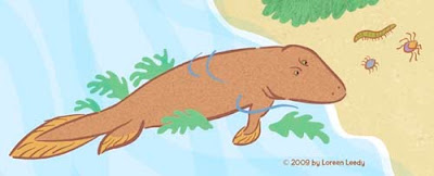
Anyway, the first art sample is below, a Tiktaalik trying to decide whether it’s worth the struggle to flop around on land to go after some creepy-crawlies. Or maybe he’s just gazing wistfully and resolving to sign up for some legs.
(Hmmm... a mysterious line has appeared on the two images below... just ignore it, please. I would redo the images, but have managed to lose one version due to one of those “Save As“ snafus.)

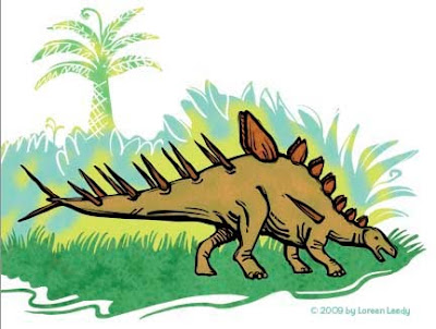
I’ve been thinking that the above style is okay but not that dynamic. So below is a stegosaur (Kentrosaurus) rendered with a bolder black line. Better? Worse? Either is okay?
Of course, the fabulous thing about Photoshop is the ability to play with different color schemes, thus using up the time saved (if any) by using digital media. Either color version looks pretty good to me. I'm going to try having more black laced through the entire image to see how that looks. This is just a part of a page, maybe a third of it.
All of the line art and the plant shapes were done in Illustrator with the blob brush. This previous post goes into detail about the blob brush. Then the paths were pasted into Photoshop, filled, colored, and textured. BTW, the texture in the grass is from a photo of reindeer moss. Wonder if reindeer moss had evolved by the Jurassic Period? Or grass for that matter? I do know the reindeer hadn’t!

Thursday, September 10, 2009

Love the new Illustrator blob brush

That is how these plants and the beastie below were drawn. There’s something ironic about using such a 21st century tool to draw prehistoric life.... I’ve never used Illustrator that much despite having it for at least a decade, but it seems the time has come. Photoshop, for all its wonderfulness, just can’t make lines this crisp. Illustrator brushes have an adjustable “smoothing” option that (surprise) smoothes out the wobbles and bobbles in each stroke. I keep the level pretty low and have to redraw some lines, but overall it works wonderfully well to create attractive, swooping line work. You also can make the size vary according to the pressure, and several other parameters.
What’s helpful about the blob brush is that it automatically merges all lines that overlap and are the same color. Saves some steps. When you don’t want the lines to combine, the regular brush is the one to use. One problem I ran into that took awhile to figure out... once you’ve used the blob brush, if you switch back to the regular brush, it won’t work. Instead of the cursor, it shows a circle with the slash through it. You have to open the brush panel and choose a brush tip, then it works again. There may be some other way to avoid this, but whatever works, right?

Next step is filling in and otherwise coloring these in Photoshop.

Monday, March 30, 2009

Cleaning up stray pixels in Photoshop

This is scanned artwork with the contrast exaggerated to make it easier to see the problem of stray pixels caused by paper texture, dust, etc.
How do you deal with this problem, especially when it’s hard to see where the pesky little unwanted pixels are? Usually when I'm working on an image in Photoshop, the stray pixels are less obvious, more like the image below:
What’s the big deal, anyway... who cares about a few stray pixels? In some cases they won’t matter, but when your image will be used as an illustration it’s amazing how often they turn into glaring blotches in the printed piece that really are bothersome. To find and eliminate them, read on.

This is line work that has been scanned in and lifted off the background white paper. This post explains how to do that.

I zoomed in to erase any visible pixels. But are there more lurking? To find out, add the Stroke Layer style to the lines layer. In the top menu bar, choose Layer>LayerStyle>Stroke. When the dialog box opens, use these settings (most are default):
Size- 3 to 5 pixels
Position- Outside
Blend Mode- Normal
Opacity- 100%
Fill type- Color (pick a bright contrasting color such as red)


Either the drawing suddenly contracted chicken pox, or the red stroke around every pixel shows that there are indeed many stray pixels. Select them with the Lasso tool and delete or use the Eraser tool to remove them.

These car images can be enlarged by clicking on them, by the way.

I don’t worry too much about a few blips near the line work, since they will blend in. It’s the glitches floating inches away that seem to show up most annoyingly in the printed book. Now that the art is cleaned up, time to finish coloring it in. Don’t forget to get rid of the Strokes Layer style. The easiest way is in the Layers palette, drag the Effects to the trash, the small icon on the lower right.

Here’s our little car, ready for his close-up. Wonder why he’s got a sail on top?

Tuesday, March 24, 2009

One last try at a logo (I hope!)

As mentioned in this previous post, I’m attempting to come up with a logo and/or banner for I.N.K., a group blog written by nonfiction children’s book authors. The previous ideas posted on I.N.K. are here.

It turned out to be a big learning experience, the main lesson being “simplify!” I kept wanting to imply a sequence of events and/or add too much information. Also, in looking at a lot of author and book-related logos, the pen/ink bottle imagery is quite the cliché and pretty old-fashioned. In this day and age of word-processing and PDFs, maybe some other metaphor would be better.

The other surprising-to-me bit of information is that some of the bloggers didn’t want the logo to be “kid-like.” Not too babyish I get, but not kid-like? Maybe those terms mean the same thing in some people’s minds... whatever! It demonstrates not only the difficulty of working with a group on a project like this, but also the limitations of doing things by email.

Anyway, I’d prefer the logo to be kid-like, definitely, but not over the top with cutesyness. I went with “printed pages” as the concept, with differing fonts to represent the diversity of bloggers. The bright colors invoke youthful vitality and will show up well even at a small “button” size on a web page.
I’ve already received some comments that it’s not anything like the previously posted ideas, and some people liked one or the other of those. Hey, they were too elaborate and I like this one! The multi-colored one, that is. I did this version below for the more visually conservative. But I hope nobody votes for it, secretly. (Guess it’s not a secret now!)

However, there are other contending ideas from another talented artist. So, who knows what the logo will be in the end? The I.N.K. bloggers are voting in the next day or two, so we’ll see what happens.

Wednesday, March 18, 2009

Inspiration needed... please!

I write once a month for I.N.K., a group blog for children’s nonfiction authors. We have hundreds of subscribers and just had our one year anniversary, so it’s about time we developed a logo and/or banner to gussy up the blog. My Studio blog readers are a very visual bunch, so I hoping some of you will visit the post on I.N.K. and leave a Comment to help us figure out what to do.

The image below is a colored-in version of one of the ideas. It’s not final art, but it’s a reasonable facsimile. I don’t pretend to be a logo designer, so don’t be afraid to make suggestions to improve this or one of the images on the I.N.K. site.

Thanks for any input! (Now that I’m looking at it, maybe the ink bottle should be filled in with black... what say you?)

Thursday update: how about this one?

Sunday, March 15, 2009

Rise and shine! Digital fun with layers

This hand-painted little sun doesn’t look very promising yet, but let’s see what can be done to jazz it up in Photoshop. It was painted on plain Strathmore drawing paper with black watercolor in a drybrush fashion. I used a lightbox so no pencil lines had to be erased, then it was scanned in. The process of getting rid of the white background is detailed in this previous post.

The first thing to do was even it out a little because it was too heavy on the left side. I used the Lasso tool to select a chunk on the left, then nudged it right a few notches.

What I’m going to do in this post is basically describe what is on the different layers, without going into detail about how to do every little thing.

The background layer was filled with cyan, the sun was filled with yellow, then a new layer in between has
orange which makes the orange circle and fills in the holes in the original sun.

The sun was too flat and needed more *glow* so an airbrush was used to paint white in the upper-right center and on the rays. This makes three layers so far, the blue background, the orange color underneath, and the sun on top.

This is fine for a simple illustration, and in fact will be used in a book I’m working on now due to space limitations. But what else can be done with it?

New layer: To make some irregular triangular pointy shapes radiating outwards, I used the Lasso tool. (If the shapes needed to be more controlled the Pen tool would work better.) They were filled with orange. I’ve left the sun layers turned off here so you can see what was going on, but actually all layers were visible the whole time.
New layer: On top of the pointy shapes, I drew white lines with a rough-edged brush. To make them conform to the pointy shapes, they are grouped in a clipping group.
New layer: Under the pointy shapes, I made these circles of radiating lines. It’s too complicated to explain here how this was done... but if you learn how to adjust the brushes, it’s easy. (A future post, for sure!)
New layer: Just above the background cyan, I used a “speckle” brush with blue-violet paint to make this texture.
Here’s how it looks now...it certainly has come a long way. One more tidbit... you see how the white lines fade out next to the sun? That was done by adding a Layer Mask to the white-line layer and masking them, i.e. making them invisible. You could also do it by erasing with a soft-edged eraser, but that can’t be reversed.Once you have everything on the various layers, you can change colors, move things around, etc. This is why I love working digitally, to be able to explore lots of options and see how different colors, textures, shapes, etc. interact and what looks best to me.
This is an exploded side view of the layers. Pretty cool, isn’t it?You don’t have to learn all these ins and outs of Photoshop (or Elements or other similar programs) to be able to change colors, layer things, and otherwise take advantage of the tremendous power of digital visualization.

Happy pixel playing!

Friday, March 6, 2009

Photoshop tip: Remove white from scanned drawing

Scanning your drawn or painted artwork is a great way to combine the best of both worlds... the beauty of a hand-rendered image plus the flexibility of digital image making. This electric tea kettle is a character in my next picture book, so he’ll be the victim today. He’s painted with black watercolor in a dry brush technique on regular Strathmore drawing paper. Once scanned into Photoshop (at 300 pixels per inch) you can see the problem, the white paper background.Before anything further can be done, the image must be made more contrasty with Levels. The main task is to get rid of the paper texture, since the line work is already black. This is done in the Levels dialog box by moving the right arrow towards the center until the paper is really white. (If a drawing is scanned in, you can also darken the gray lines if desired by moving the left arrow towards the center.) The image below shows before Levels on the left, after on the right. Not sure if it will show up very well, but it’s better not to have a bunch of stray pixels all over the place as we continue. (Unless you want the paper texture for some reason, in which case Levels can make it more visible. Just play with the arrow sliders.)The easy way to get rid of the white is to change the blending mode in the Layers palette to Multiply. Many artists do this and it works fine. The Multiply technique works best for black or dark lines, because of the way Multiply mode interacts with the layer(s) underneath. If you want to color the lines and/or move parts of them around without getting bungled up with pieces of invisible white you need to completely separate the line work from the white paper and here’s how (on the Mac):
1 Make sure in the Layers palette that your scanned art is highlighted and in Normal mode. (A layer is highlighted when you click on it.)
2 Be sure the Channels palette is open. While holding down the Command key, in the Channels palette click on the RGB layer. This selects the white.
3 Hold down these three keys Command>Shift>the letter i. This inverts the selection.
4 Press Command>Option>letter J. A dialog box will come up, name the new layer Lines.
5 Turn off (click eyeball) the original scanned layer. You should see the black lines in their own layer.
6 With black as the foreground color and the Lines layer highlighted, hit Option>Shift>Delete. This fills any remaining pixels with black.
Make a new layer underneath the lines, and fill it with white or whatever color. Your image should look similar to the picture above, but the difference is that only the lines are on the layer, which allows you to color them any way you like. To color the lines, be sure to lock the layer first, by pressing the ?/ key. Locking the layer means that transparency will be preserved, only already-existing pixels can be painted on. You unlock it with the same key.

So here are the kettle lines, colored all crazily. This just can’t be done in Multiply mode.
The kettle will probably end up more like this, actually:So, I hope this tip is useful, if a tad geeky. I’m still using CS 1 but this has worked for many versions of Photoshop, so should still be there. The author Deke McClelland wrote about this technique in Photoshop 4 Studio Secrets, which is where I heard about it.