If you’re in the Dunedin, FL area (near Tampa), there is a nice quilt show at the Dunedin Fine Art Center until August 9th. The exhibit is called Sawtooth: New Quilts from an Old Favorite, organized by the National Quilt Museum in Paducah, KY. As the title says, each quilt is inspired by the traditional sawtooth block. The show was quite diverse, with whimsical fish, bursting fireworks, a look down the rabbit hole, and florals. Another favorite was the gecko quilt that can be seen here (at least until their web site is updated.) Unfortunately I didn’t write down the info for the quilt below, but it was very eye-catching as you can see.  The detail below is from a different quilt. It caught my eye because of the way the various thread colors and stitching patterns created additional imagery of glowing suns without actually piecing the sawtooth shapes. In addition to the main exhibit another bonus was a display of auction quilts and small journal quilts by a local guild, the Innovative Quilters (be sure to go all the way into the classroom area to see them all.)
  Naturally we had to stop around the corner at Rainbow’s End. As far as I can tell, it is indeed the largest quilt shop in Florida, with three rooms stuffed with bolts, over 20,000 according to their site. As well as a large choice of batiks, Asian styles, 30's prints, flannels, and other typical quilt fabrics, there’s a large Christmas section, a nice group of metallic wovens, and many large scale prints (below)... definitely something for everyone.
 The downtown is very cute, with shops strung along a meandering Main Street only a block or two away from the water. We were fortunate to arrive early (11ish) at Café Alfresco, which fills up fast due to their yummy offerings. This storefront looked inviting.
 Here’s a closer look at the turquoise crocheted bag. It has beads, braided handles, and strips of fabric woven into the crocheted stitches. Very summery.
  Hope you enjoyed this mini-tour!

Back in March I posted about making fabric grass... today’s post is about choosing fabrics for the rest of the landscape. This project will be code-named LIQ for now since it’s not yet the time to get too specific about it. It will consist of a series of whimsical quilted scenes with various characters running around, such as Jenny. Below is a simple mockup of three fabrics intended to convey grass and sky.
 I like the look of this overall... bright colors, interesting but not overwhelming patterns. But it is also clear that it would be ever so dull to use the same fabrics and grass colors over and over in each quilt. In a comment about the fabric grass post, reader Margaret had suggested using orange or red embroidery floss for grass, and that got me thinking about also using tones of yellow, gold, etc. to represent grass, farm fields, and wildflowers. It naturally has provided an excellent excuse to go into fabric acquisition mode, as evidenced below:
 You will also notice in the sample (top) that the sky is not blue, but is a white tone-on-tone fabric. In the bird samples shown here, the sky is a turquoise blue. While I love blue, it seems to darken the whole image too much, while the white sky makes a nice contrast to the land colors. Of course plain white seems a tad, well... plain, so I’m also looking for white fabrics with a pattern either in white or a fairly pale pastel as shown below. It’s difficult to see the pattern on the white ones, but putting a blue or lavender fabric underneath will bring it out, hopefully.
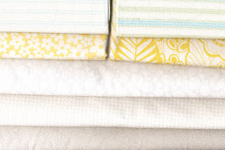
 Notice to fabric manufacturers: Where are the white fabrics with pastel patterns? They’ve been very hard to find so far, but next week we’re making a trek to the largest quilt store in Florida, Rainbow’s End. They have over 20,000 bolts, so there should be some options available there(!)
As you can see by the photo to the left, my stash contains a good selection of various other colors to work with, just need to fill in a few gaps. In general the fabrics for this project are quite different than what I had been buying for my other art quilts, which are not especially whimsical. What LIQ requires are geometrics and graphic patterns with clear colors, not painterly or natural patterns with an “artsy” look, for lack of a better term. Hey, I’m just doing what the art tells me, you know?

There must be dozens of ways to attach pieces of fabric onto a background fabric. For a whimsical project I’m working on, the question is which one to use? In the post about Jenny, she was still unattached (hmmm... perhaps she could try Internet personals.) Anyway, the birds below show a variety of treatments. Satin stitching, topstitching, machine blanket stitch, etc. There isn’t any blind stitching on these, but we know what that looks like, right? I made these awhile ago and hadn’t looked at them closely again until today. Probably my least favorite is the satin stitching. Maybe it’s just the way I do it, but it looks kind of rigid or something.
  Actually, I think the mix of techniques and thread colors is nice and adds to the whimsical effect. It just might be the answer for Jenny and the rest of the gang.
Hope you’re having a creative week!


 The detail below is from a different quilt. It caught my eye because of the way the various thread colors and stitching patterns created additional imagery of glowing suns without actually piecing the sawtooth shapes. In addition to the main exhibit another bonus was a display of auction quilts and small journal quilts by a local guild, the Innovative Quilters (be sure to go all the way into the classroom area to see them all.)
  Naturally we had to stop around the corner at Rainbow’s End. As far as I can tell, it is indeed the largest quilt shop in Florida, with three rooms stuffed with bolts, over 20,000 according to their site. As well as a large choice of batiks, Asian styles, 30's prints, flannels, and other typical quilt fabrics, there’s a large Christmas section, a nice group of metallic wovens, and many large scale prints (below)... definitely something for everyone.
 The downtown is very cute, with shops strung along a meandering Main Street only a block or two away from the water. We were fortunate to arrive early (11ish) at Café Alfresco, which fills up fast due to their yummy offerings. This storefront looked inviting.
 Here’s a closer look at the turquoise crocheted bag. It has beads, braided handles, and strips of fabric woven into the crocheted stitches. Very summery.
  Hope you enjoyed this mini-tour!


